2024 Cabinet Trends

As 2023 comes to a close, there will be new home trends gaining popularity for 2024. Whether you want to keep your home up to date with the latest trends by adding the color of the year, replacing your backsplash with the trendiest tile pattern or want to see what's new in woodworking, our blog is going to be the place to be every Friday until 2024.

We will be counting down to 2024 by sharing the latest home trends on our blog. Are you looking for kitchen renovation ideas? This week we’ve got your back. Kitchen cabinet styles have changed many times over the years from material to style to color or even having cabinets at all. Open shelving has had its moments of popularity. The new year has many different trends expected. Keep reading to find out what cabinet trends are coming in 2024.

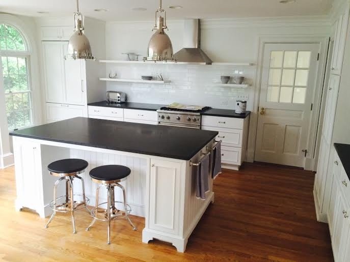
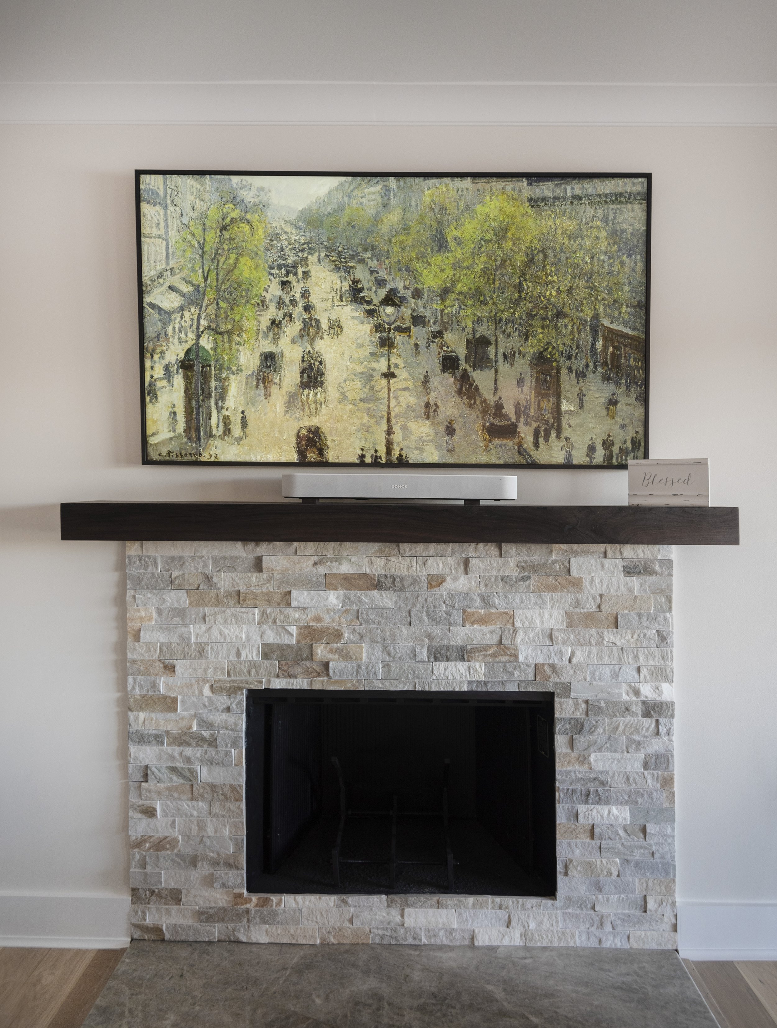
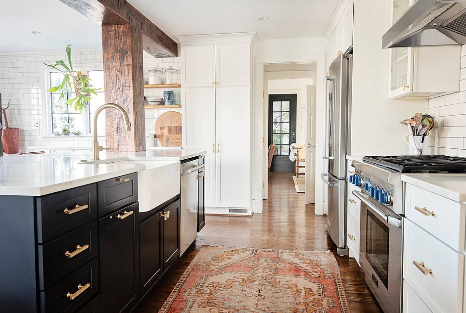
Painted cabinets have been all the rage. If you held off on that home project, you’re in luck! Natural cabinets and wood grain are expected to become popular again in the new year. The appreciation for natural materials is slowly but surely showing up in homes again. Utilizing the natural look of certain woods and different materials can create a space of warmth when paired with the right hardware, backsplash, and countertops. 

Wood grain may not be your thing. Don’t worry, painted cabinets are still expected to be trendy next year. Bright whites are a common color chosen for kitchen cabinets. 2024 is expected to see creamier colors in cabinets. Off white and creamy taupes are going to be the popular color choice for cabinets once we ring in the new year. 

Do you currently have plain white cabinets and want a change? Consider refinishing them. Did you know cabinet refinishing is one of our favorite projects? We can help you pick a color to change your space without a reno. Another cabinet trend expected in 2024 are orange and red undertones in painted cabinets or natural cabinets. Looking for a paint color that is still neutral but has warmer undertones like red and orange can switch up your space without fully committing to a brighter warm tone like clay or terracotta colors and staying on trend for 2024.

Keeping with the red and orange undertones trend but staying away from painted cabinets, woods with warm undertones are also expected to make a comeback in 2024. Warm red and orange colors have been popular for years in materials other than cabinets and it is expected for those paint colors to move into wood materials next year. Having wood cabinets that have a red hue will be popular in the new year along with the lighter wood grain cabinets that are also expected to trend in the coming months. 

You may think your traditional cabinets or furniture is outdated but blending some of those traditional pieces with modern elements is the way to go in 2024. Creating a cohesive look with your traditional pieces and adding modern elements can create a timeless space that has sentimental value. This hybrid style is perfect for your cabinets because it will create a cohesive feel throughout your entire home.

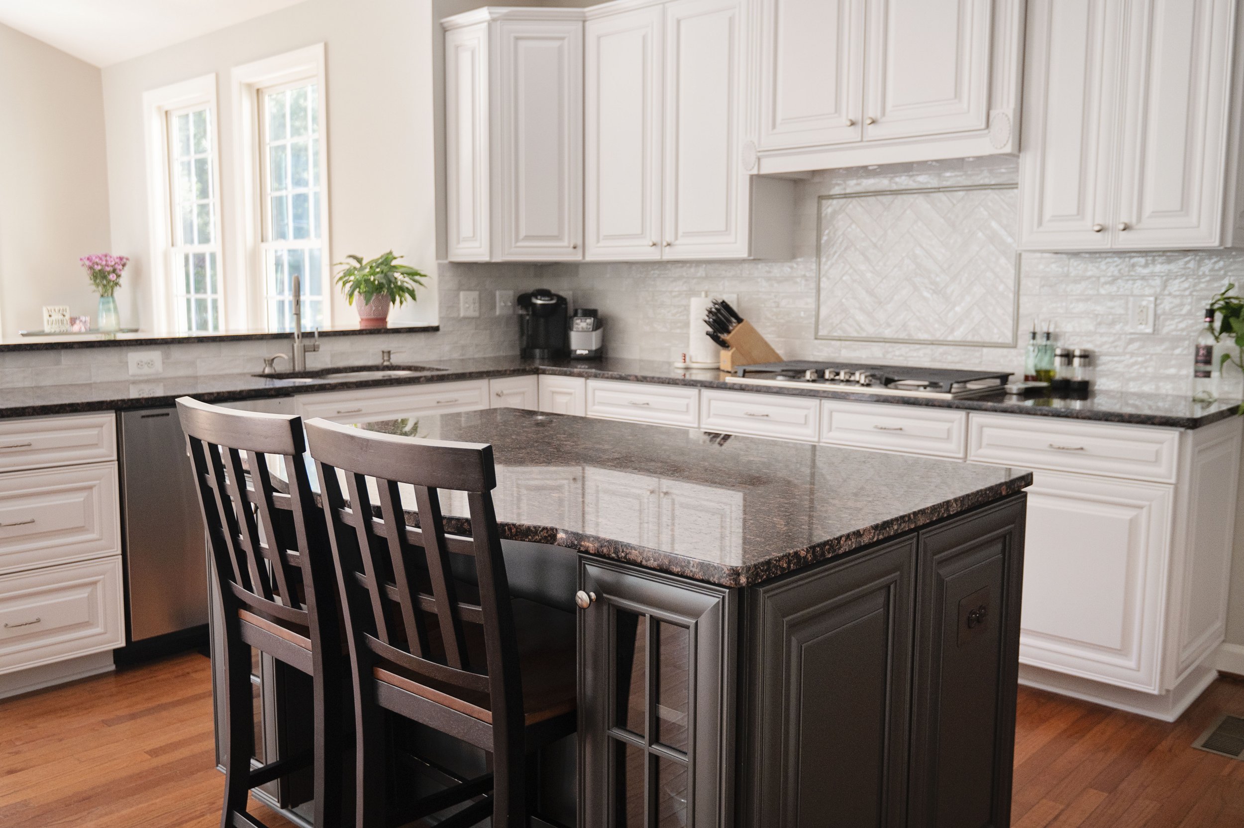
The last cabinet trend expected in 2024 is mixed color cabinets. This has been a project we have done for many years but this coming year it is going to be more popular than in the past. Having 2 different colors for your cabinets is expected to be popular in the new year. Maybe your upper cabinets are off white while your lower cabinets are a natural light wood grain. If you have an island, your island cabinets could be refinished to a shade with red or orange undertones and the perimeter cabinets are a creamy taupe. 

These trends may have sparked an idea for a kitchen project. We do all kitchen renovations, big or small. You may want to gut your whole space or just do a small refresh. Contact us and we will get you in touch with our property services division. You may be interested in cabinet refinishing which we like to call our “no demo reno” which can update your whole kitchen without the mess of a full renovation, let us know and we will get you an estimate for cabinet refinishing. 31 more days until 2024!

Picking the perfect tile

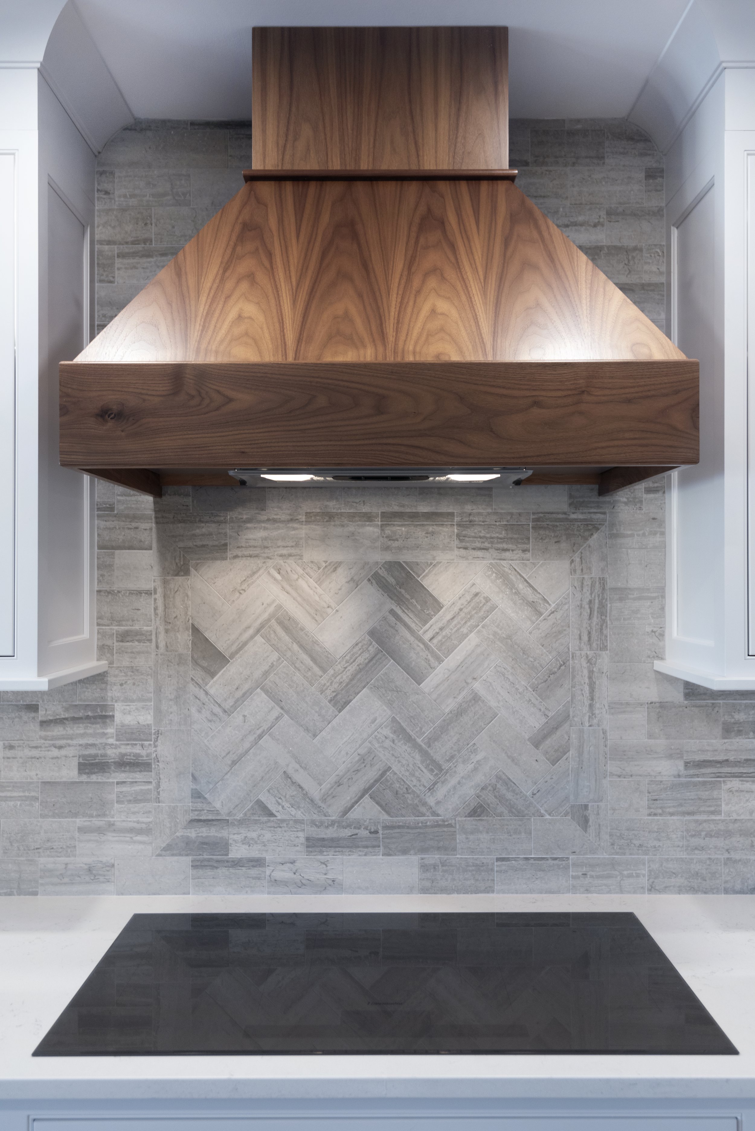
Picking the right tile for different parts of your home can be a tough task on its own, but then figuring out what pattern to lay your tile is quickly your next step. A fun pattern can add character to a simple tile while a simple pattern might be the perfect pairing for  a unique tile.

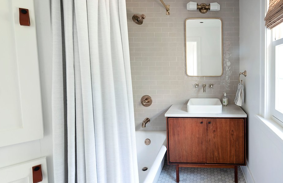
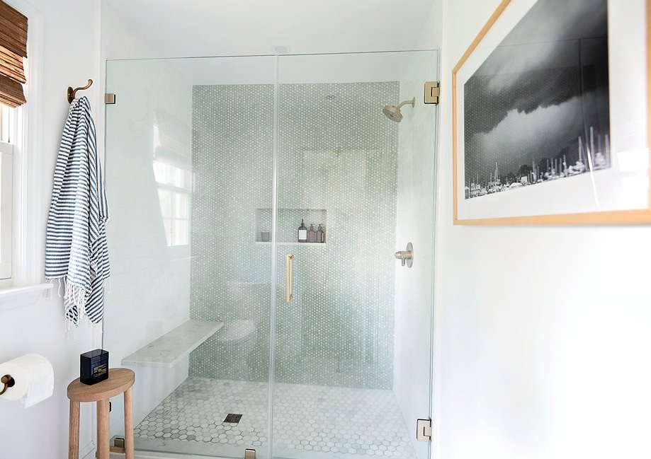
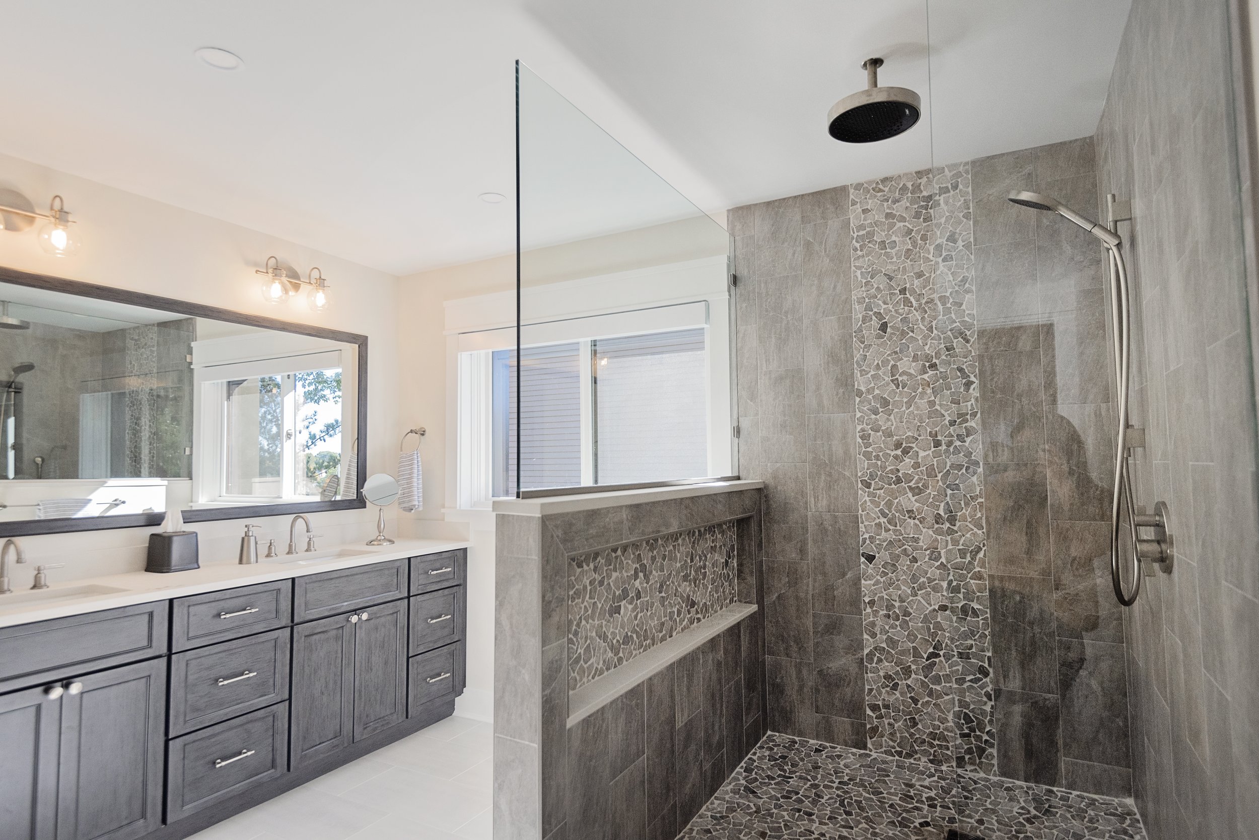
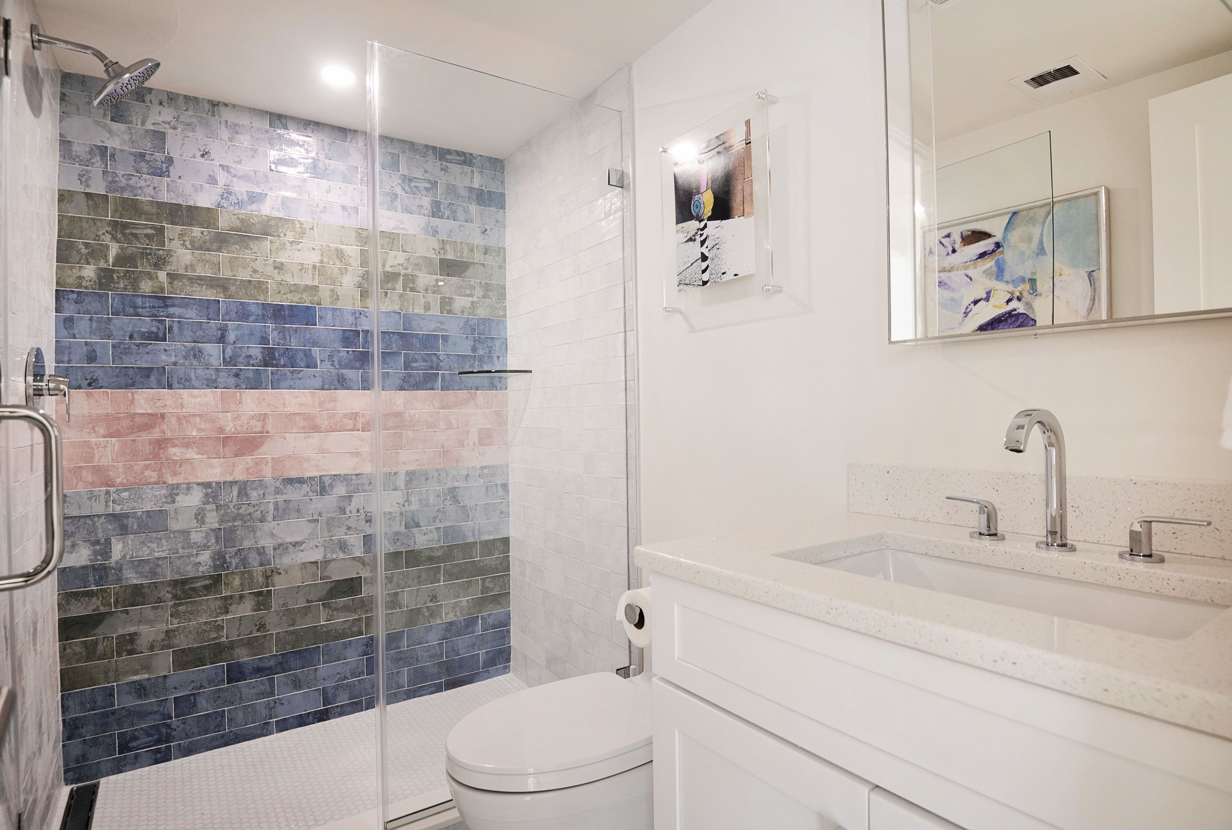
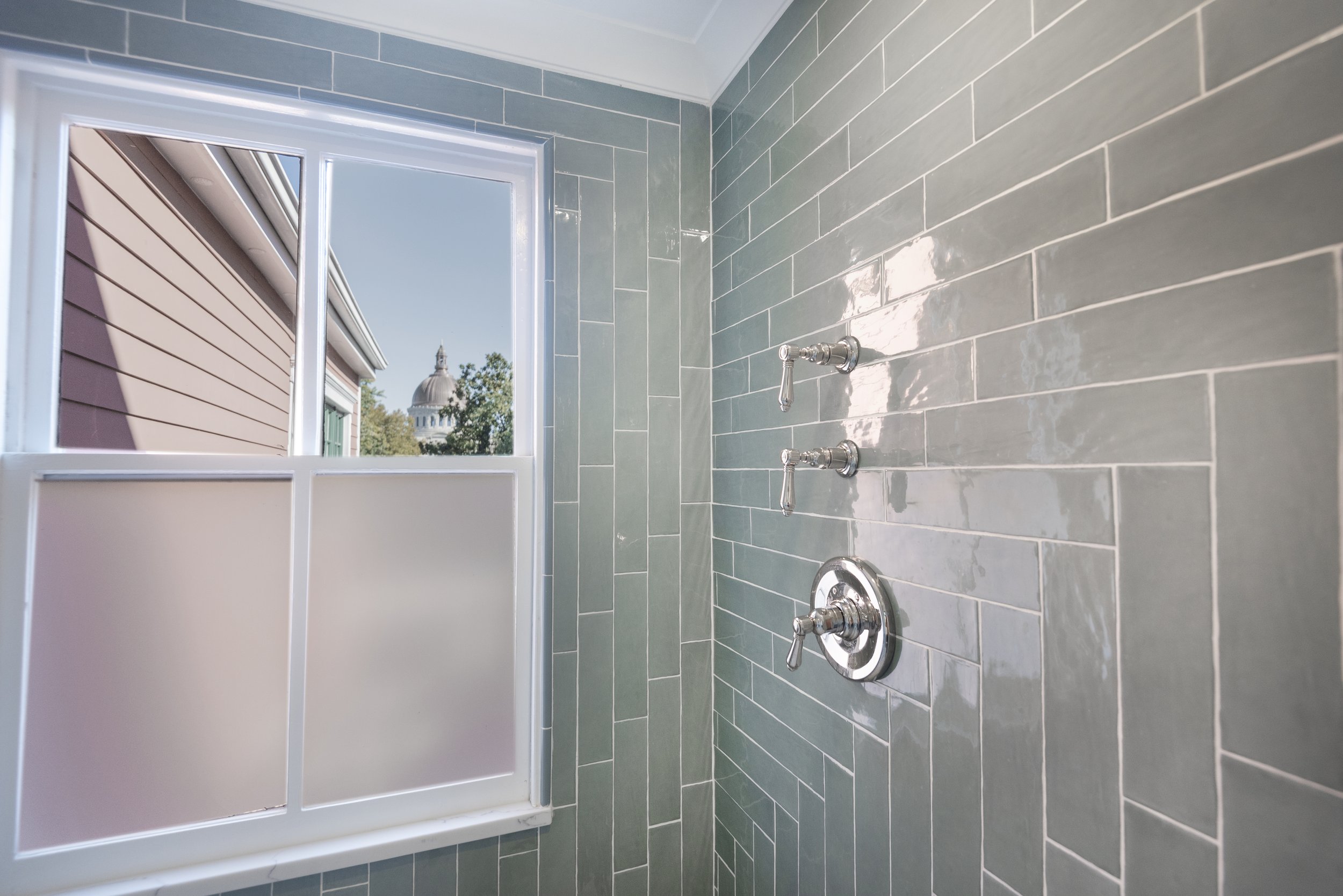
A bathroom can be a great place to create a fun space, especially with different tile options. Picking a classic subway tile can be a great option for shower walls but laying them in a herringbone or parquet pattern can elevate this simple tile. 

Laying tile vertically rather than horizontally can also change the look of the space. Vertical and horizontal patterns can be straight stacked or offset by different distances. Depending on the look you are going for, straight stacked tiles can look great with other details in your space. On the other hand, laying your tile offset by ½, ⅓, or even ¼ can add a different look to your shower, backsplash or anywhere else you put tile in your home. 

Adding different shaped tiles together can also change the look of the space. You may want a simple and clean look with all white tile, but want to add something unique yet subtle. Using different sized squares together can create a different look than a regular grid of all the same size tiles. Mixing squares and rectangles in the same design can also add some extra character to your space.

These decisions may be hard to make, but our team at Blue Star can help you out every step of the way. From helping you decide which pattern to lay the tile or giving you options for the tile themselves, we want to make sure you love the updates to your home.

Downtown Annapolis Painter

Have you ever visited Main Street downtown? Maybe you have purchased a dress at J. McLauglin or art for your home from Kim Hovell. If you have been downtown recently, you probably have seen our trucks in the area.  You could have seen some of our work and didn't realize. We recently painted the storefronts of Wheat, J. McLaughlin, Kim Hovell, and Tyler Böe

We started out each of these projects with the most important step, the proper preparation. Prepping the area before painting is crucial to getting the best possible results during a project. We want to ensure that each day the store looks brand new to all people walking by and those shopping in the stores. 

We take our time painting all of our projects to make sure all customers are satisfied with the work and it lasts as long as possible. The exterior of the store is the first thing someone sees and often determines if they will enter the store. We want to make sure that the storefronts downtown have as many potential customers as possible. 

Your business could be the next storefront on Main Street that we paint. Contact us if you want to be the next property Downtown that we paint. We hope you enjoy looking at these storefronts as much as we do.

Make a statement with your backsplash

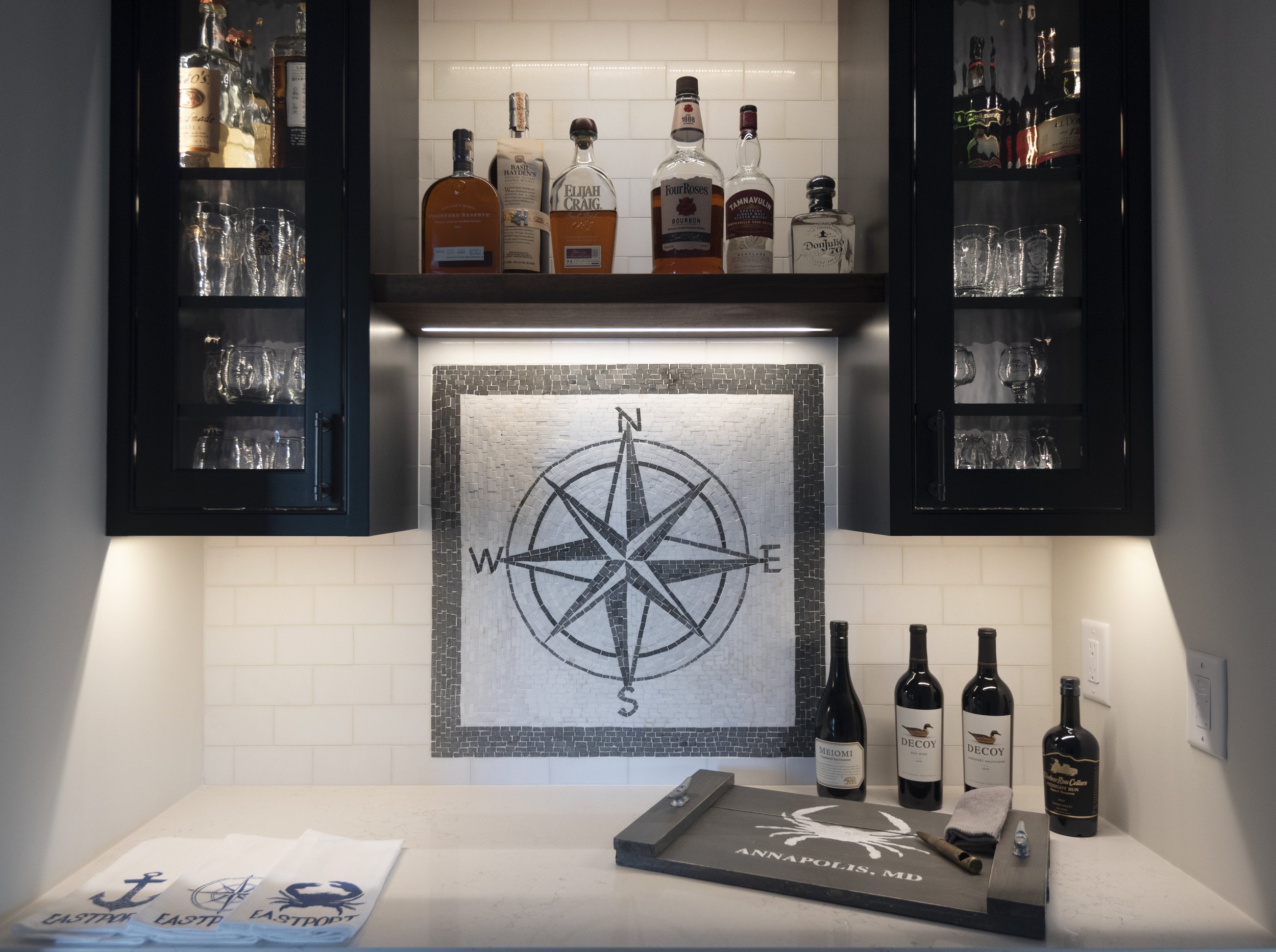
Backsplash can completely change the way your kitchen looks. You can use a unique design, a tile with a bright color, or even the same material as your countertops. Backsplash is used to protect your walls from the potential damage that could come from everyday use in a kitchen. Whether you accidentally spray water out of the sink or turn on your mixer speed too high when making a cake, the backsplash can make sure your kitchen stays looking pristine.  

Just because your kitchen’s backsplash serves a helpful purpose does not mean it needs to be boring. Adding a pop of color to your kitchen with backsplash can allow your kitchen to make a statement. There is not a right or wrong choice when it comes to backsplash, but you want to make sure it complements your countertops and cabinets. 

There are several material options when it comes to backsplash. Here are some options that may fit in your space. 

Using a bright color backsplash can bring a once boring kitchen to life in a unique way. There is more freedom with using colors than you might think. Using a few different shades of one color can create a different look from just using one shade of blue for example. If you would like to use just one color you can add extra spunk to the backsplash with the pattern the tile is laid in or the shape of the tiles themselves. 

Marble can create a show stopping look when used for backsplash. If you are thinking of getting marble countertops, consider extending the same marble up your walls as backsplash. This style of backsplash will add a luxurious feel to your space and make your space look more high end. In addition to looking great this material works great for backsplashes because it is durable to heat and any messes you may have. 

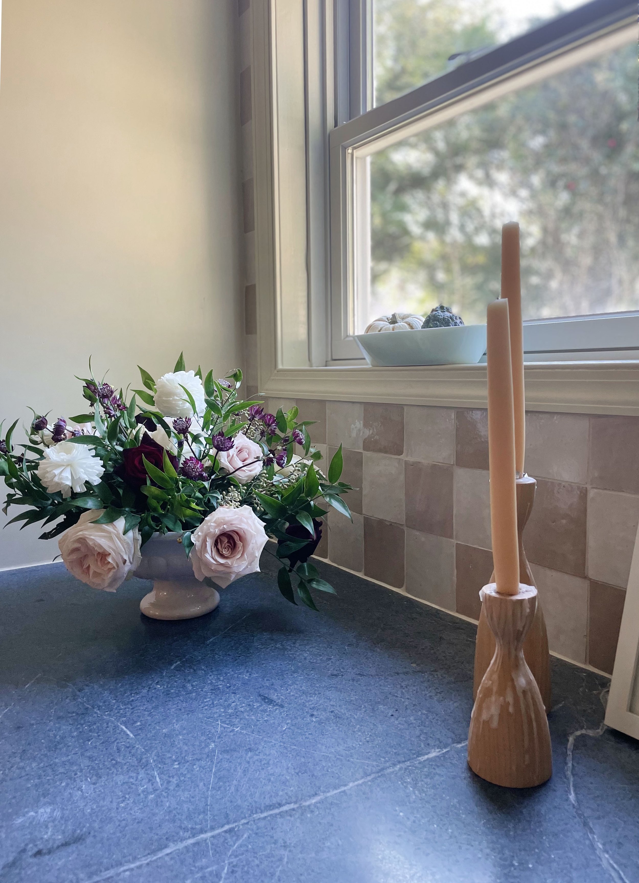
Backsplash isn’t just about the tile. It’s also about the grout. Picking an out of the box color for your grout can add a different look without having to commit to a large amount of color. Using a dark grout with a lighter tile can emphasize the shape of tile you chose and bring more attention to your backsplash. 

There are many different options and materials when it comes to choosing a backsplash. Let Blue Star help you pick the right option for your style and your home.

Thinking of heading to the beach?

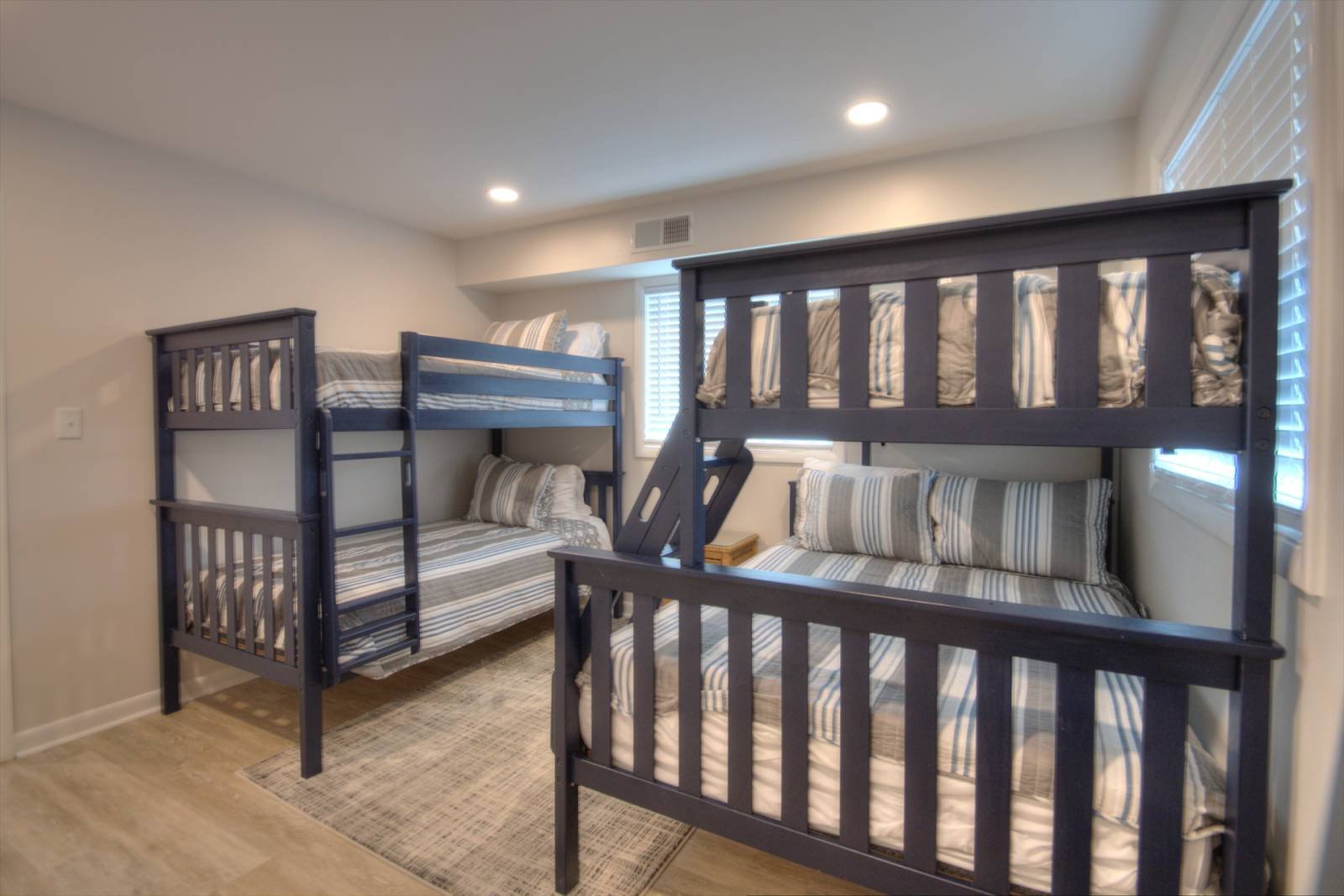
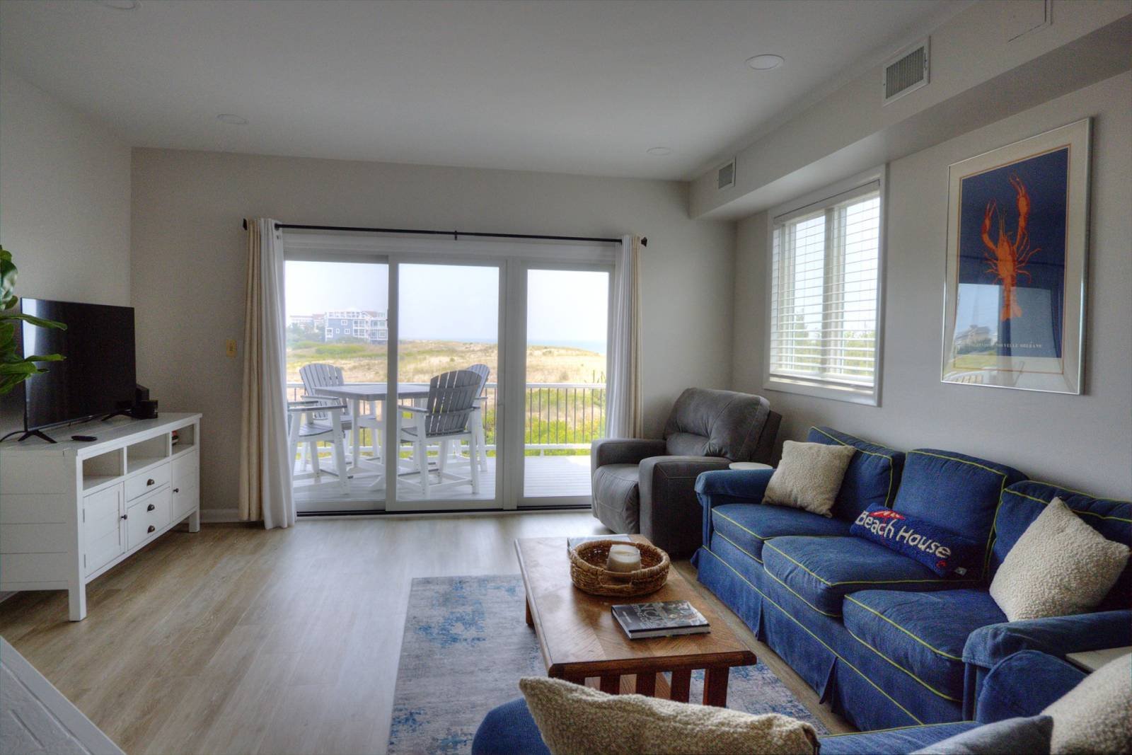
If you are planning to visit Fenwick Island soon, we have just the place for you to stay. Blue Star recently completed a complete renovation of a property on Fenwick Island in Delaware. If you are ready to put your feet in the sand and watch the beautiful sunsets at the beach, make your way to one of the Delaware beaches and stay at this iTrip Rental. It is the perfect place to take your next vacation. 

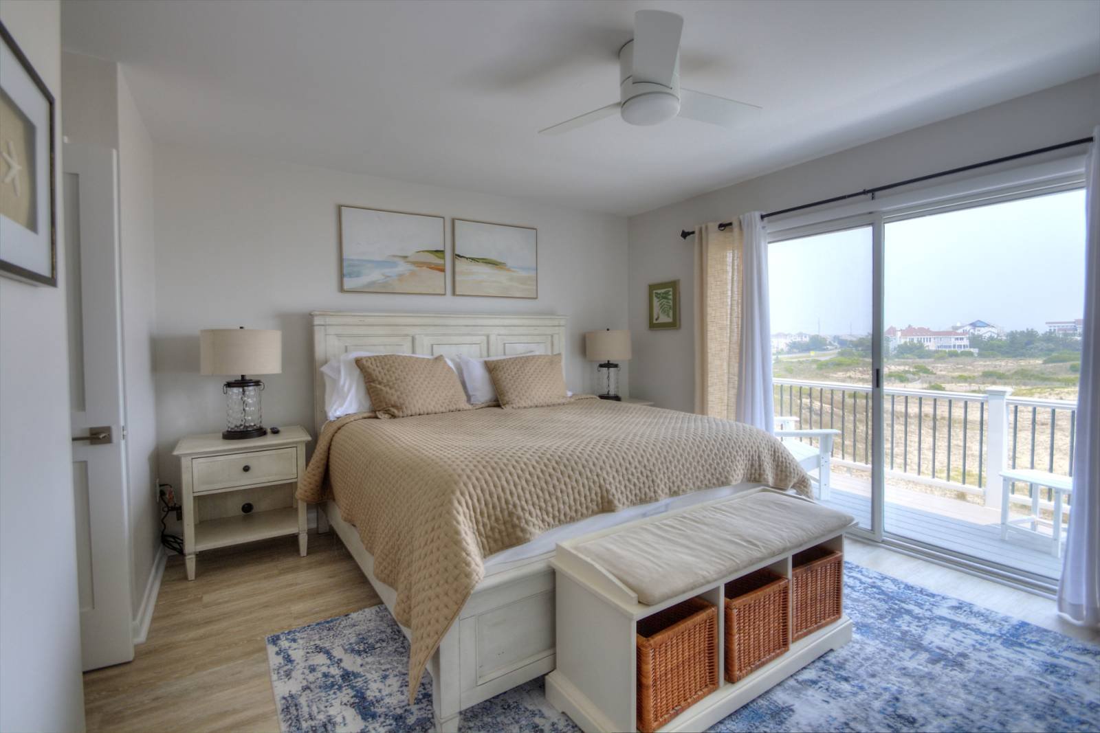
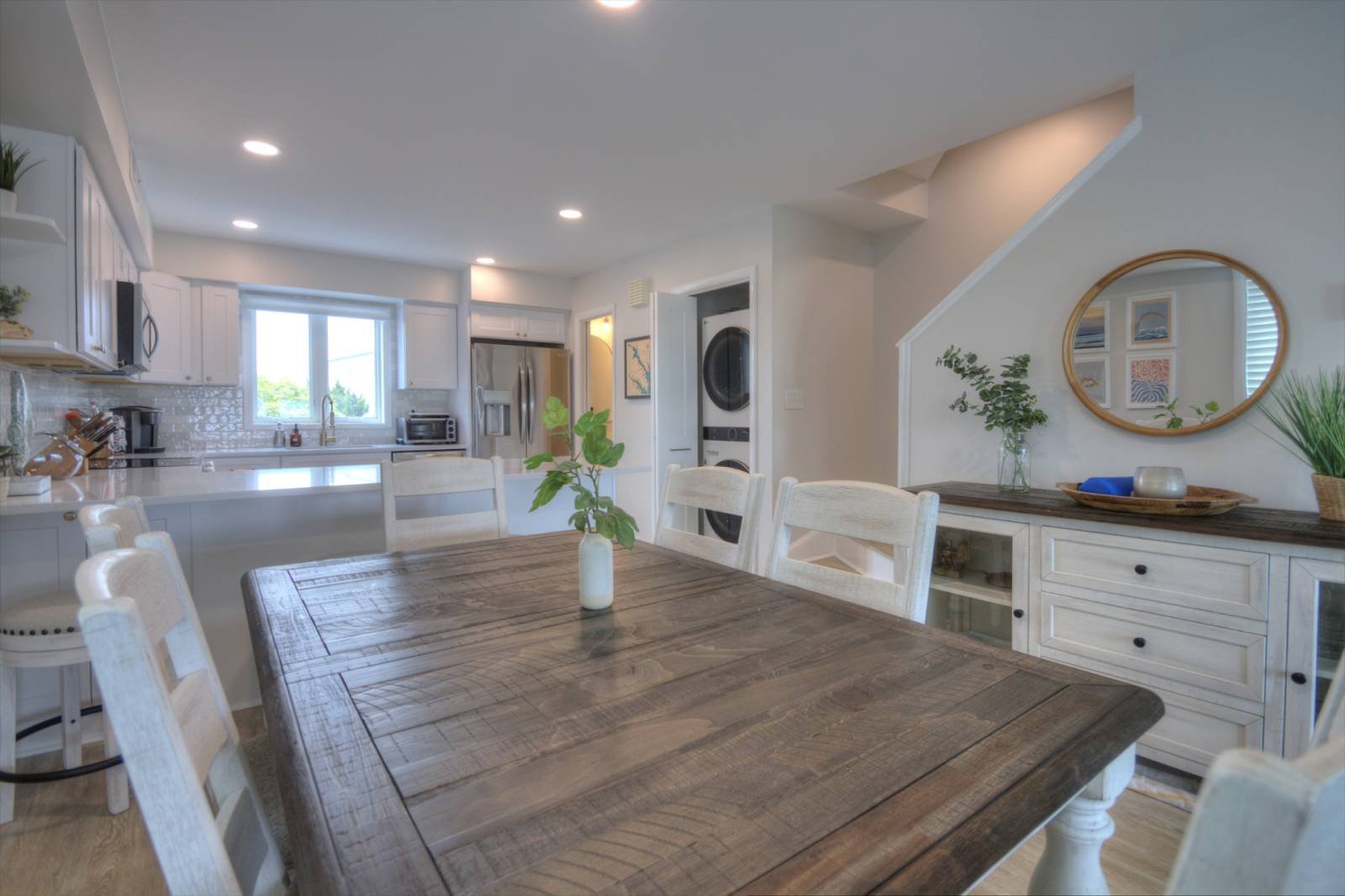
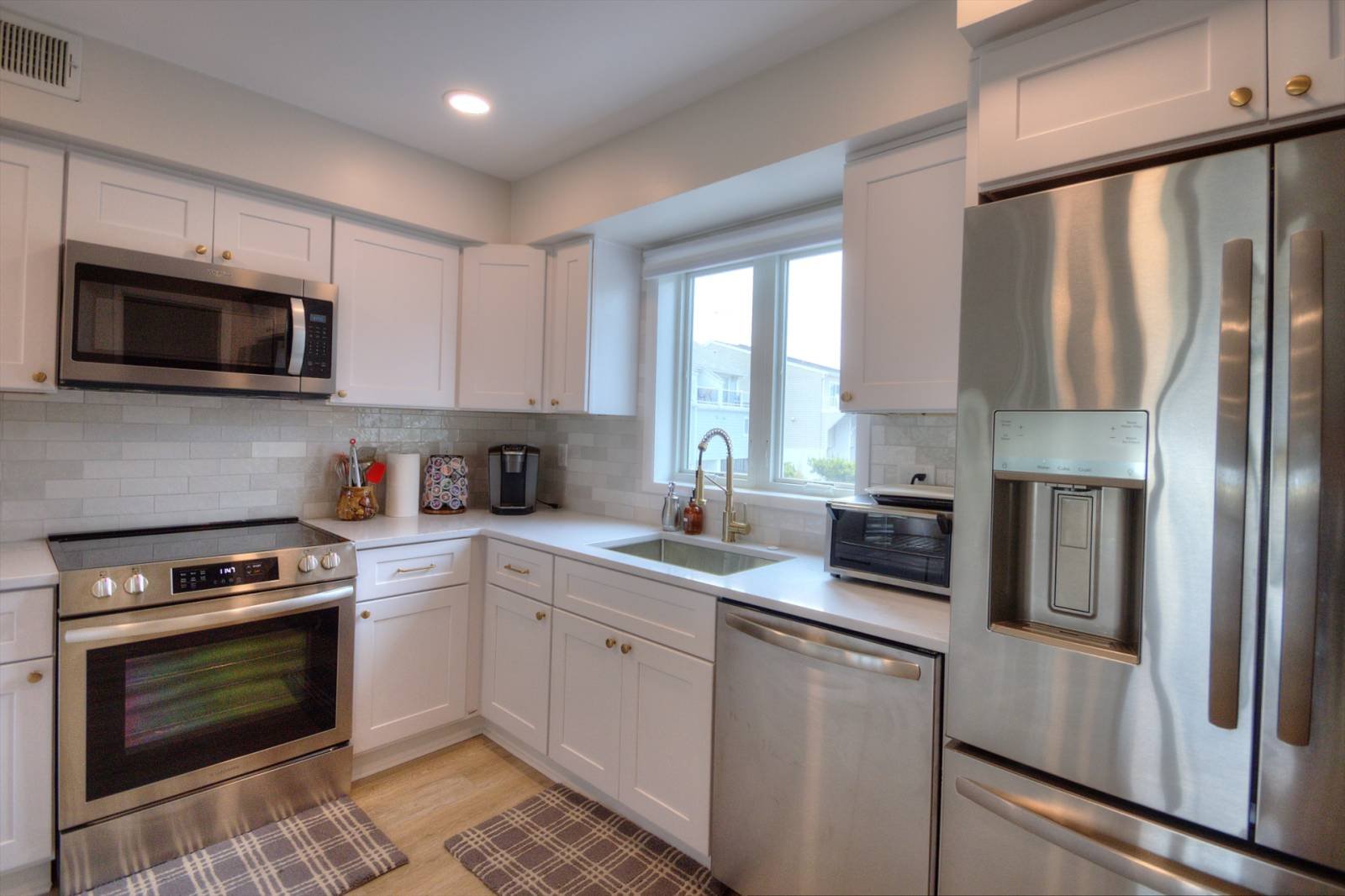
The Delaware shores property is just steps away from the beach and has been fully renovated. We remodeled the bathrooms and the kitchen. Our crews also updated the flooring, painting throughout, and fixtures all around the property. It is right on the water so making sure the style of the rooms reflected the beach was important. Utilizing beige and blue shades throughout kept with the beach theme of the property. These colors can be seen throughout the flooring and tile in the bathrooms as well as paint colors throughout the rest of the rooms.

This Fenwick Rental sleeps 9 with one room having two sets of bunk beds making it a great place to stay with lots of kids. Blue Star is happy we were able to renovate a property where many people will be able to make memories with their friends and family. Being able to go back to a great place after a day at the beach makes the vacation that much better.

After a long day at the beach all you want to do is take a relaxing shower and have a nice dinner. These brand new bathrooms are the perfect spot to unwind after a day at the beach. The kitchen is spacious and open, perfect for cooking meals for all 9 guests. The next time you are traveling to Fenwick, make sure to remember this property for your travel accommodations. We loved this project, and we hope you do too.

A Guide to Paint Sheens

Different paint sheens work best in certain rooms. Some sheens make a wall easier to clean, while others can hide imperfections better. At the end of the day it is your preference what sheens of paint you use throughout your home, but we do have some suggestions of the best place to use each paint sheen.

Glossy and High Gloss

The highest reflective sheen is glossy and high gloss paints. This sheen can have a glass-like effect and is the easiest to clean. This sheen is the most durable. This paint is best used in kitchens, cabinets, on doors and window trim. 

Semi-Gloss

This sheen is slightly less reflective than high gloss paints. Semi-gloss paint provides a slick smooth surface for your walls. One of the great advantages of this sheen is its resistance to moisture and the ease of cleaning these walls, all you need is a damp cloth. Semi-gloss paint is perfect for kitchens, bathrooms, window trim, and crown molding throughout your home. 

Satin

Satin is another popular finish for its ease of cleaning. With it being less reflective than other paints it is more flattering over imperfections in a wall. This sheen is perfect for high traffic areas of your home. Since this sheen is easy to clean and hides imperfections well, it is a great choice for kid’s bedrooms, foyers and family rooms. 

Eggshell

If you want a paint sheen that is not shiny but not completely matte, eggshell is the best choice for you. This sheen is slightly easier to clean than flat paint. Eggshell covers imperfections in a wall very well and looks great in dining rooms, living rooms, and bedrooms. 

Flat/Matte

Flat paint is the least reflective sheen and easiest to touch up when needed. Flat paint is great for hiding bumps and scratches on your walls and is most commonly used on ceilings. It is also a good option in primary bedrooms, studies, and formal sitting areas.

The perfect accent wall for your space

Different accent walls can fit different spaces, different styles, and different homes. Depending on the look you are going for, one style accent wall will probably be a better fit than another style. Some accent walls can be traditional, bold, modern, and even rustic. Which style of accent wall would best fit your space?

A bold accent wall may not be everyone’s style but utilizing this style of accent wall can really bring the right space to life. Utilizing a bright colored or patterned wallpaper is one way to create a bold accent wall in your space. A bold pattern can be used in a small portion of a space and still bring lots of dimension to your room. Bold accent walls can complement a room and create a bright and fun space. 

If you are interested in creating an accent wall that adds dimension to the space while keeping it traditional you may want to add beadboard paneling or box molding. Beadboard paneling can add depth to your walls without even changing the color of your room. The paneling can be painted the same color as your other walls to add a subtle accent to one of the walls or be painted a contrasting color to add a prominent accent to your space. 

Box molding is another way to add texture to your space without having to add more color. Adding trim in the shape of boxes to your walls can create a traditional look to your space while adding dimension to your walls. This design for an accent wall is great for dining rooms, living rooms and primary bedrooms. 

Traditional may not be your style but rustic might be the right fit. If you want to add a rustic or even industrial style to your space, adding an exposed brick accent wall might be the perfect addition to your room. A brick accent wall is able to change the look of your home and add interest to your space. Brick may not be the exact look you are going for but shiplap can also add to the rustic or farmhouse feel of a home and is another option for an accent wall.

Accent walls can enhance a space of any kind. Whether it is in the living room off of your farmhouse kitchen or the wall behind the bed in your primary bedroom, accent walls can bring a once dull room together as the perfect space to spend your day. You spend a lot of time at home, you want to make sure you love looking at the home you live in.

Have you ever heard of contrast trim?

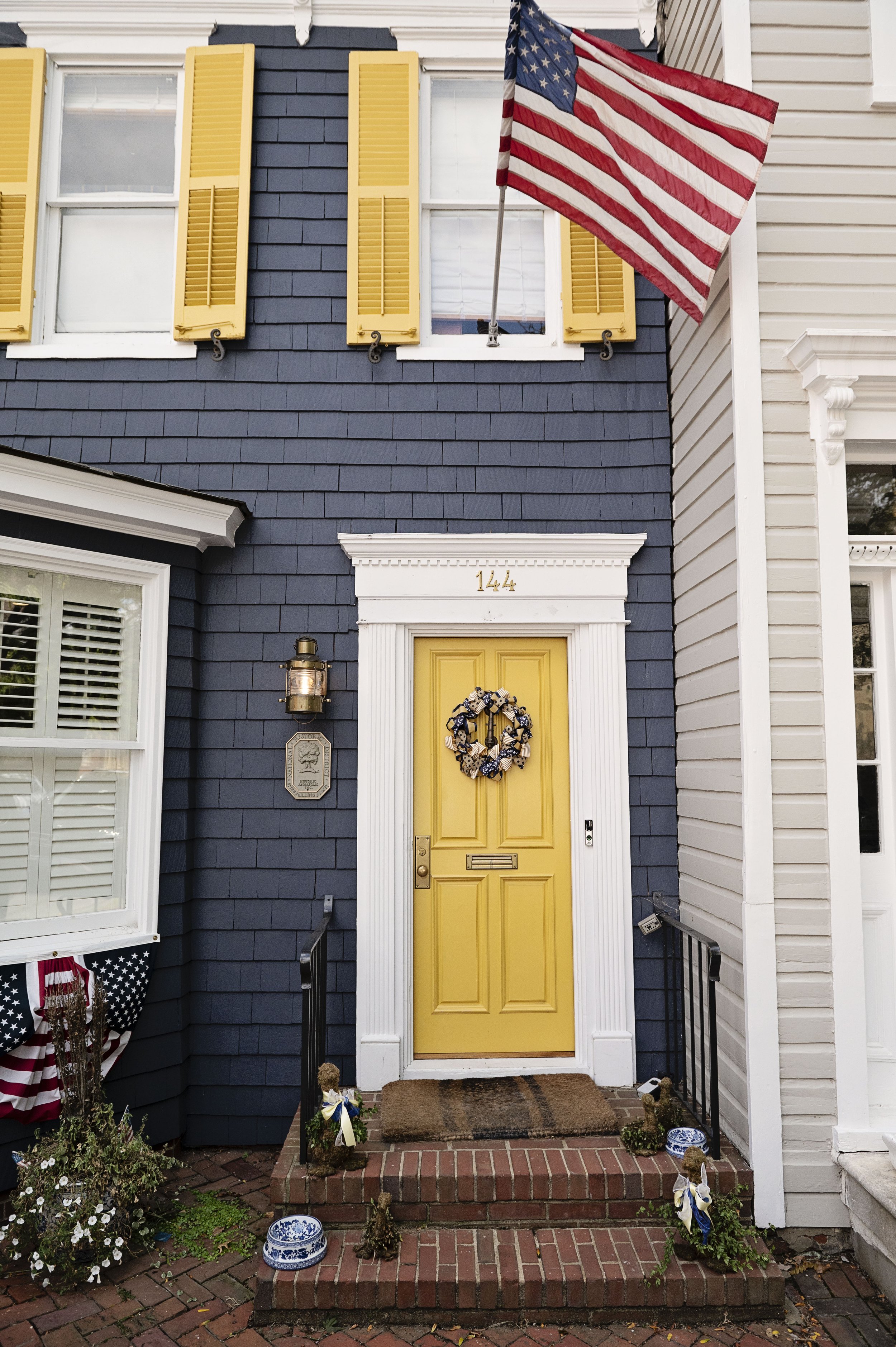
You may want to change the look of your home but not paint the walls. Contrast trim is a great way to change the look of a room in a unique way. Contrast trim is taking a different color to the trim around the room and even the door to create a different look in your space. Common colors for contrast trim are cream, gray, black, or a pop of color like blue or green. 

Using cream or ivory paint for your trim against white walls can keep your home bright and neutral but add more character to the space. It can be hard to commit to a bright color but adding variation in the trim with cream paint can make a space feel more fun without adding any dark or bright shades to the walls. 

There are many looks that can be created by using contrast trim but another color that adds dimension is gray. Light gray or greige paints can be used for contrast trim depending on the look you are going for. Choosing a color between a true gray or a greige may depend on the rest of the design and colors in your home. If you have a cooler toned home, a true gray may be the better choice for your space while a warm toned space would be better with the greige contrast trim option.

If you are looking for a strong contrast in your trim, black is a great color to choose for contrast trim. Black paint can have a similar effect of staying neutral with the color you choose like cream or ivory trim but provides a more eye-catching contrast against your walls. 
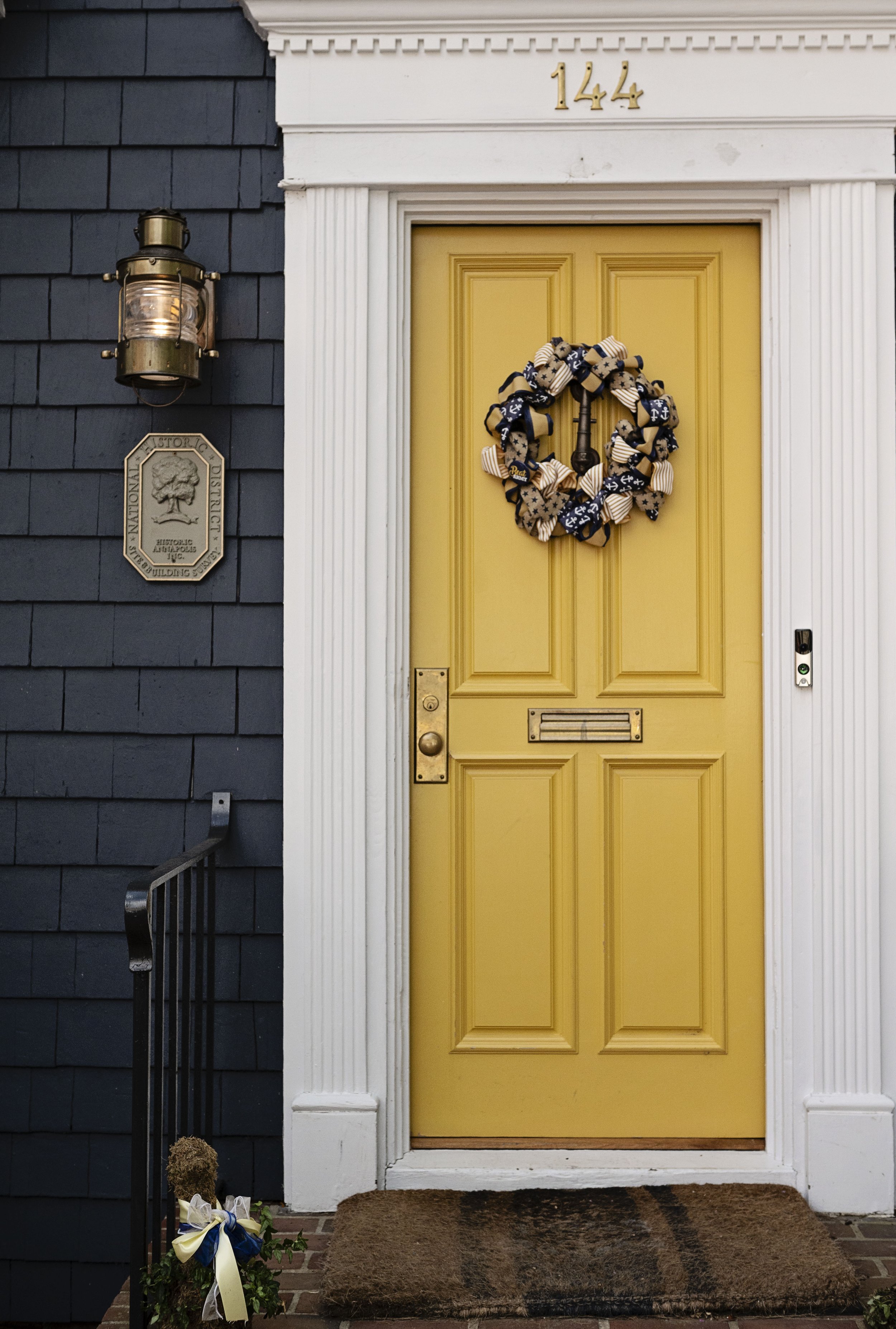
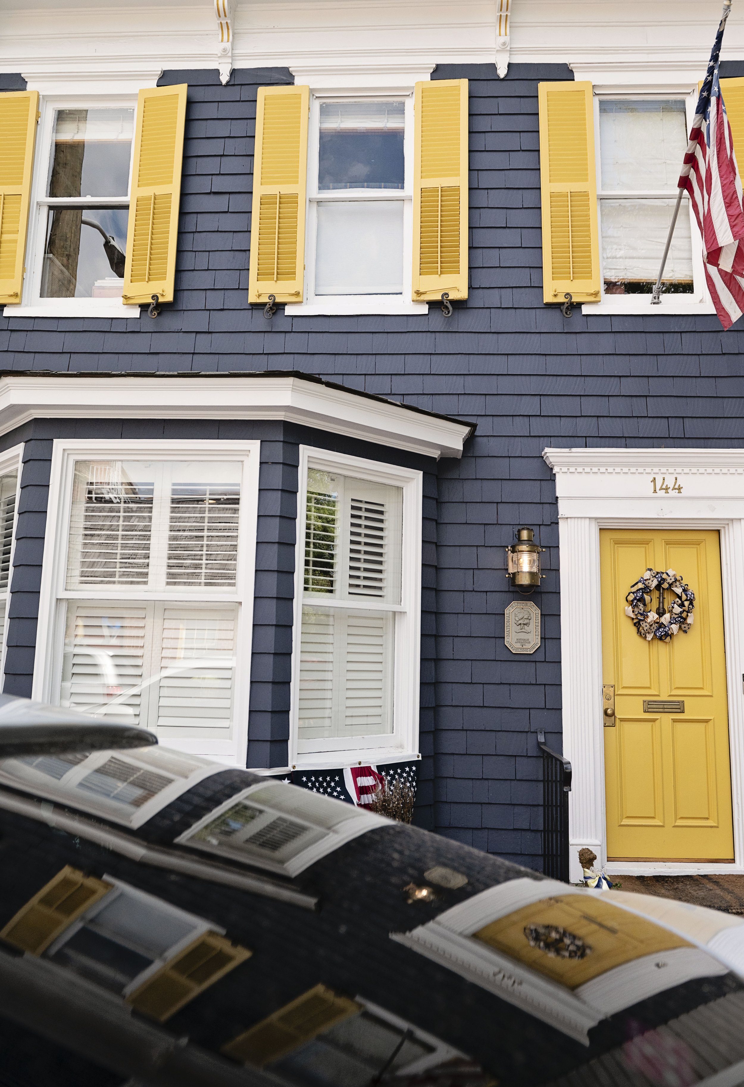
Pops of color in trim is also a unique way to add color to your space. Having blue or green trim and doors in a room can add color in a minimal way to bring brightness to the space without being overwhelmed with color.

Spring is Always a Great Time For Exterior Painting

Spring is the perfect time to tackle home improvements, particularly when it comes to your exterior painting. If your home needs refreshing or you would like to transform its look, schedule your painting contractor for a spring slot now. The following list highlights the advantages of a spring appointment.

What Are the Benefits of Spring Exterior Painting?

1. Ideal Temperatures

Temperatures between 50- and 60-degrees are ideal to complete your exterior painting. This is because they allow your paint to dry at the right speed. The paint won’t dry too rapidly in the heat or sit wet for days in cooler temperatures. It will bond properly to your siding and form well for a seamless finish.

2. Beat the Rush

Most homeowners wait until late spring or summer to schedule their residential painting. This is because they want to take advantage of the warmer temperatures and the longer days. Some may even begin to notice winter damage on their home siding.

Contractors’ schedules begin to fill up, and they may charge more for their work as they are in demand. By scheduling an appointment at the beginning of spring, you can beat the rush to get the right contractor at an affordable price.

3. Prepare to Sell

If you have been thinking about selling your home, spring is an ideal time to place it on the market. Your landscaping will look its best in warmer weather and ensure instant curb appeal. A fresh coat of paint inside and out makes your residence look newer for a perfect first impression and a higher perceived value.

What to do to Prep Your Exterior Before You Paint

Your exterior painting projects require just as much planning as interior ones. There are certain preparations that make the process of painting your house smoother for your painting contractor. Perform the following tasks to achieve the best results.

What Should You Do Before an Outdoor Painting Project?

1. Make Repairs

If your house needs repairs, get them done ahead of time. This will ensure that the paint goes on more easily, as it is tough to apply to rough or rotting materials. Getting the repairs done now will ensure that you don’t have to repaint areas later once the problems are finally fixed.

2. Trim Trees & Shrubbery 

Do you have a big tree in your yard with branches that hang over your house? Trimming any trees that could potentially be blocking areas of the house will make the painting process much easier. Even big bushes may get in the way of painters.

3. Remove or Cover Patio Furniture

A piece of outdoor furniture could not only get in the way of the painters, but it could also be at risk of getting a new paint job by accident. Move any outdoor furniture to your garage, basement, or attic for the duration of the painting project. If the furniture is too heavy to move, cover it with a tarp to protect it. You can tie the tarp down with rope, so it doesn't blow away in the wind.

Trending Kitchen Renovation Design Ideas

Many homeowners want a kitchen renovation to make their cooking space more functional. Updating the style can also help you gain a high return on the investment if you decide to sell your home. Here are a few popular ideas to consider including in your remodeling plans.

How Should You Renovate Your Kitchen?

1. Consider Quartz Countertops

Granite is no longer the number one choice for homeowners. Instead, manufactured quartz has taken over thanks to its non-porous surfaces and beautiful finish. The material won’t hold onto germs and is super durable, so it’s great for families and amateur chefs.

2. Make Cabinet Doors & Drawer Pulls Simple

Skip round wood or ornate ceramic knobs in favor of simple, geometric hardware. Silver or wrought iron bars are trending for cabinet doors and drawer pulls. Some people hide the hardware all together, opting to update their kitchen with hidden handles like notches on the bottom of high cabinet doors and the top of lower storage solutions. 

3. Remove Upper Cabinets

Many people renovate their kitchens because they want the room to feel larger. By removing the upper cabinets and installing open shelving, you’ll create the illusion of more space. This will also display your favorite dishes and kitchenware. 

4. Pair Natural Cabinets with Modern Appliances

Instead of turning the entire kitchen into a sleek, modern room, consider choosing an aspect of this style and mixing it with more natural options. For example, upgrade to chrome appliances with raw wood cabinetry for a unique look.

5. Include Hardwood

Hardwood floors offer a low-maintenance, easy-to-clean option for kitchen renovations. This long-term investment is the perfect fit for this high-traffic room because you can quickly sweep or wipe up messes without worrying about ruining the floor. Plus, this material can look pristine for decades with regular maintenance and occasional resurfacing.

Three Cabinet Choices to Consider for Your Kitchen Reno

Cabinets are a great place to start your kitchen renovation project. You’ll want an option that’s practical, accommodates all your appliances, and matches the aesthetic of your home. If you’re overwhelmed by all the options, consider these popular styles.

What Are the Different Types of Kitchen Cabinets?

1. Shaker

Shaker cabinets are comprised of several parts: stiles (vertical pieces at the sides), rails (horizontal pieces on the top and bottom), and a recessed or raised center panel. Each component is typically made from quality American wood like cherry or maple. 

Because of their classic aesthetic, these cabinets are easy to incorporate into a range of kitchen styles, from traditional to contemporary. They’re one of the most popular and affordable options used in kitchen renovations.

2. Beadboard

Beadboard cabinets are made from vertical slats of wood fitted together with ridges or “beads” between them. The result is a more textured, intricate design that incorporates well into a cottage or farmhouse style kitchen. They’re often made from medium-density fiberboard which closely resembles wood. 

Customize this option by choosing the width of your slats. For a more traditional look, opt for a consistent width or else modernize them with varying ones. 

3. Flat-Front

Flat-front cabinets or slab doors are made from a single piece of plywood or medium-density fiberboard that is painted your preferred shade or covered in a wood veneer. Having no panels or framing, they fit nicely into a minimalist or contemporary aesthetic. This streamlined finish is a perfect canvas for ornate knobs and pullers. With a smooth surface, cleaning and refinishing will be easy.

Four Reasons to Replace Your Kitchen Cabinets

When planning a kitchen renovation, you may think about updating the floors, wall coverings, and appliances. However, changing out the cabinets also offers many benefits. Here are a few reasons to add new cabinetry during your next remodeling project.

Why Install New Cabinets During Kitchen Renovation

1. Functionality 

Remodeling is the ideal time to consider ways to improve your kitchen. Perhaps you wish there were deeper drawers to store more pantry items, or more open shelving to highlight dishes you love. Changing your cabinetry can help you meet your aesthetic and functional needs.

2. Style

Eventually, your cabinets may look dated. For example, homes built in the 1980s may feature storage that has white door paneling and light wood accents. While this was a popular choice at the time, the styles have changed since then. Speak with a design expert or research the look of modern kitchens to make sure your home looks up to date.

3. Home Value

Swapping out the cabinets may seem like a major task; however, it will pay off by improving your home value. If you ever decide to sell your home, potential buyers will be more interested if they like the look of the space. They’ll also appreciate that you’ve already updated the kitchen, so they don’t have to plan for that project before moving in.

4. Repairs

Over time, kitchen cabinets often incur damage due to wear and tear. The hinges and doors may feature markings and stains, and storage under the counter might have water damage from leaks. Improve the structural stability and appearance of your cabinets by taking the opportunity to update them.

Three Reasons to Paint Your Office

A new office building has a lot of potential from its white walls, open floor plans, and neutral carpet. Over time, these new additions start to feel old when the carpet begins to tear, or the paint starts to chip. An interior painting job can increase the value of your building and improve the moods of your clients and workers. If you want to enhance the appeal of your business, consider giving your office a new look. 

Why Prioritize the Interior Painting of Your Business?

1. Creates a Positive First Impression

It’s human nature to judge a business based on the way a building looks. If a client comes into your business for the first time and sees cracking paint, an unpleasant color, or ripped wallpaper, they may distrust the quality of your work. It may seem to them like you have little attention to detail and have low value in customer service. A graphic design company or any creative industry should make this step essential, or your customers will think you have no imagination. 

2. Start of a New Direction

A business that’s been around for a long time could benefit from interior painting. As decades change, so do styles and designs. Walking into an office building that takes you back to the 1970s may be ideal for an old record shop but will look outdated for an advertising company. Your business needs to update to stay relevant.

3. Improves Overall Brand and Morale

Interior painting is done by contractors before selling the business. Contractors use white or creme because it’s a neutral base for new tenants to paint over. However, white doesn’t tell the story of your brand and can affect morale negatively. Other colors affect how we feel. For example, red represents passion, and green represents friendliness. Present the emotions you want your employees and clients to feel when they step into the building. 

How to Choose a Paint Color For Your Bedroom

Your bedroom is a refuge within your home, so the decor should put you at ease and match your personality. This starts with interior painting. If you’re redesigning your bedroom, consider these color ideas before picking out your supplies. 

What Color Should You Paint Your Bedroom?

1. Neutrals

Shades of beige, white, and gray are classic choices for bedrooms. These neutral interior painting colors match with a variety of furnishings and bedding. This would be a wise choice if your decor taste changes often, or you feel most at home in minimal design. 

2. Shades of Blue

Blue paint can make a room calming, which is perfect for a bedroom. Consider the shade you’re interested in — light blue can make a bedroom feel airier and more relaxed, while navy can be romantic and cozy. If you want a more energizing look, opt for a brighter blue or teal. 

3. Jewel Tones

Rich jewel tones like emerald and ruby instantly make a room warm and inviting. These interior painting schemes can be both classic and trendy, and they pair well with metallic details. You can also create interesting contrasts with jewel tones, so consider using multiple colors within the decor. 

4. Bright Colors

Colors like yellow, green, and orange are more eccentric choices for a bedroom. The space will feel more energizing, which can be perfect for active or creative types. You might also consider bold colors if the rest of your furnishings are simple to create contrast.

How to Choose a Sheen For Your Interior Painting Project

Choosing the right paint is a rewarding way to revitalize your home and make it a reflection of your personal taste. By finding just the right color and paint finish for each room, you can make your spaces feel intentional, comfortable, and beautiful. To prepare yourself for painting, learn more about the benefits of different finishes. Here’s what you need to know.

Flat & Matte

Flat finishes have the least reflective sheen and provide a smooth, uniform look. They’re popular for their ability to hide blemishes and imperfections while still complementing well-lit areas. They’re easy to touch up, but they’re the easiest to damage. For this reason, they’re best suited for rooms with less traffic.

Eggshell & Satin

These popular interior painting finishes are slightly more lustrous than matte options. This means eggshell or satin finishes are not only more reflective, but they’re also more resilient than flat finishes. They stand up better to staining and can usually be easily cleaned with a damp cloth and soap. These finishes are ideal for areas that see a lot of traffic, like kids’ rooms, kitchens, and bathrooms. They also help spread light evenly around the room.

Semigloss & High-Gloss

For a long-lasting coat that accentuates a room’s features and softly reflects light throughout, semi-gloss finishes are perfect. These are the shiniest finishes available, and while they can bring out the best in a space, they may also reveal imperfections more clearly. These finishes are best reserved for trim, cabinets, doors, and areas that tend to see the most activity. Work with a professional interior painter to ensure they’re applied flawlessly.

How Often Should You Paint Your Home's Interior?

If you want to breathe new life into your living space, you may consider painting the interior a new color from time to time. But just how often should you do this? It’s not as simple as choosing a date and painting every wall. Here’s what you need to consider before you embark on an interior painting project.

Consider Wear & Tear

General wear and tear will occur on walls over the years, but some rooms are more vulnerable to this than others. The kitchen and bathrooms are of particular concern, largely because they’re exposed to high humidity on a fairly consistent basis.

Heat and moisture can both take their toll on the integrity of the existing paint, resulting in issues like watermarks and, in more serious situations, mold formation. If mold is a concern, you’ll need a home improvement expert to resolve the damage before you move forward. In general, it’s best to paint these areas at least every three to four years depending on the condition of each.

Assess the Sleeping Areas

Your bedroom is not likely to require frequent interior painting unless you wish to change its appearance. However, your child’s room may require a fresh coat of paint more often. Children tend to be active in their bedrooms, and the walls bear the brunt of those activities.

Crayon marks, paint smudges, and fingerprints can all affect the quality of the paint’s finish, so you’ll need to use your best judgment when assessing how often you need to tend to the walls. Every five years is a safe estimate, but if your kids are very active and the walls look less than fresh, have your painting contractor take a look sooner.

Check Less Busy Zones

Areas of the home that generally see less foot traffic are much less likely to require interior painting on a frequent basis. Living rooms and dining rooms are prime examples of areas that are generally used on a limited basis.

Both spaces typically contain large pieces of furniture, including heavily tufted couches, large tables, and cabinets. These create a barrier between people and your walls, allowing the surfaces to remain fresher and the colors to appear crisper for longer periods of time.

How to Choose Commercial Paint Colors

If you’re planning the aesthetic of your office building, you’re likely considering the commercial painting options. However, interior paint isn’t as simple as picking what you think looks good; it can also affect productivity and mood. Here are a few pieces of advice to help make this decision.

How to Choose Paint for Your Office Buildings

1. Follow Your Branding

Companies can foster brand loyalty by featuring a color scheme throughout their marketing materials, business signs, packaging, and even their offices. Select commercial painting hues that match with your business card, social media branding guides, and logo to promote your business and encourage team unity.

2. Consider How Colors Make People Feel 

Think about how you want people to feel in each area of the building. Draw on color psychology to evoke these feelings. For example, light blue promotes relaxation and stress-relief, while cobalt hues are energizing. Neon tones can be abrasive, but muted colors are often less intense.

Paint public spaces like an open floorplan office with uplifting hues like green, while energizing meeting rooms with brighter tones to encourage brainstorming and positive interactions.

3. Stick with the Building Design

Always factor building architecture into interior painting choices. If the company resides in a modern building, use modern color choices like black, white, and grey with pops of color such as red or blue doors. Victorian-style structures will look more authentic with muted tones like beige, brown, and pastel yellow or green.

How to Keep Exterior Paint From Fading

Exterior painting does more than boost your home’s curb appeal; it safeguards the siding material underneath. However, because it is exposed to the elements, paint can fade over time, reducing the visual appeal of your property. Below is a guide for preventing this issue.

How Does the Sun Affect Exterior Paint?

The biggest issue when it comes to the sun and your exterior painting is ultraviolet radiation. UV rays affect the chemical bonds found in paint on a molecular level, leading to damage and a shorter lifespan.

Fading, also known as photodegradation, is a slow process where the sun’s intense rays change and weaken the paint color. Dark or bright colors are the most noticeably affected, turning vibrant tones into dull hues. 

You may also notice a white dusty film over the surface of the paint known as chalking. UV rays change the molecules of the paint so much that a new coat will not adhere correctly, requiring a painting contractor to prepare the surface properly to revitalize the color.

Visible damage, such as blistering and peeling, may also occur. Blistering is the result of an area losing its sticking quality, so the paint can no longer adhere to the surface. This bubbling can also lead to peeling, which then lets in moisture and debris, causing even more separation.

How to Prevent Harsh Effects

The sun will shine, and UV rays will beat down, but there are steps to take that can lower the risk of damage. First, choose high-quality paint that includes UV inhibitors to reduce the sun’s impact. Ensure that the type of paint you select is the right one for the material on which it will be placed. The paint you would use on siding, for example, is not necessarily the right choice for masonry because of alkalinity levels and its effect on stone.

As for colors, certain hues do not show damage as much as others. Tans, browns, beiges, and similar subtle neutrals fade more slowly and less noticeably than bright blues or yellow.

Four Paint Colors That Make Rooms Feel Bigger

Decorating smaller rooms can be challenging. You don't want to overcrowd them and accentuate the lack of space, but leaving them too bare will make the space feel empty and unusable. Luckily, there are certain colors you can paint your walls that can make a room feel bigger. When it's time for your next interior painting project, choose one of these colors below. 

The Best Colors for a Spacious Effect

1. White

White is light-reflective, meaning light will bounce around the space. This works even better in rooms with lots of natural light. It also blends well with any decoration types and styles, so you can design the room as you'd like and not have to worry about the color clashing with the decor. 

2. Cool Gray

Cool gray is a great choice for interior painting because it offers a subtle pop of color instead of plain white. In moderate lighting, cool gray makes the room feel large yet cozy. The color lends itself well to modern decor styles, so if you're a minimalist and don't want too many bright colors in the space, choose cool gray.

3. Light Neutrals

Light neutrals like cream and beige make a great fit for those that want a light color without the sharp brightness that white gives. These colors will make a room feel more elegant, so pair them with light-colored furniture. 

4. Pastels

For those who want a pop of color given by their interior paint, choose a pastel. The soft tones of pastels brighten the room while making it look larger, and the pop of color gives the room an exciting ambience. They look best paired with neutral decor and are great choices for small bedrooms.