A Primary Suite Makeover: From freshly painted walls to a brand new bathroom

Your primary suite should feel like an oasis. It is the place you should be able to unwind after a long day, get a good night's rest, and have a stress free start to any day. Creating a space that truly feels like your oasis may just be the next home project to put on your to-do list. Some of our clients have an exact vision for their future primary suite, while others don’t know where to begin. We can help pull the final details together to  bring your vision to life or get out the idea books and samples to start from scratch with you.

These clients knew they wanted to increase the historic feel in their space that had been lost over the years. Another important detail with this bath remodel was increasing storage space. The bathroom did not have a clear design or style before, and it was not an enjoyable space for our clients. We knew we had to change that for them. A bath remodel can seem like a hard and lengthy task, but not with Blue Star. We made sure this project was a breeze to ensure our clients could get back to their normal routines in a new and improved space.

Bathroom Renovation

These clients were unhappy with the current state of their primary bathroom. It lacked storage and style. Adding in a larger vanity with a second sink, more storage throughout the bathroom, and updating the style of the shower were the main details our clients wanted to update about their space. Adding function and style was the goal of this bathroom remodel.

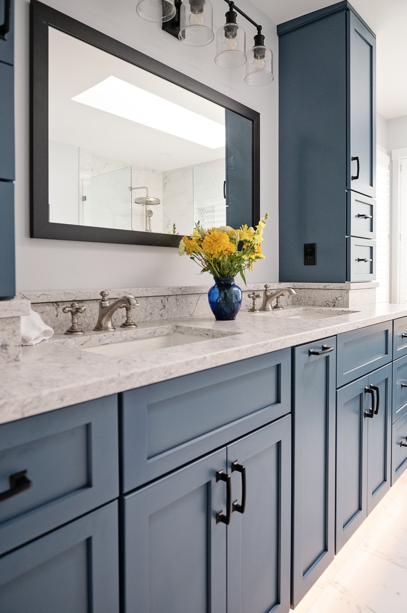
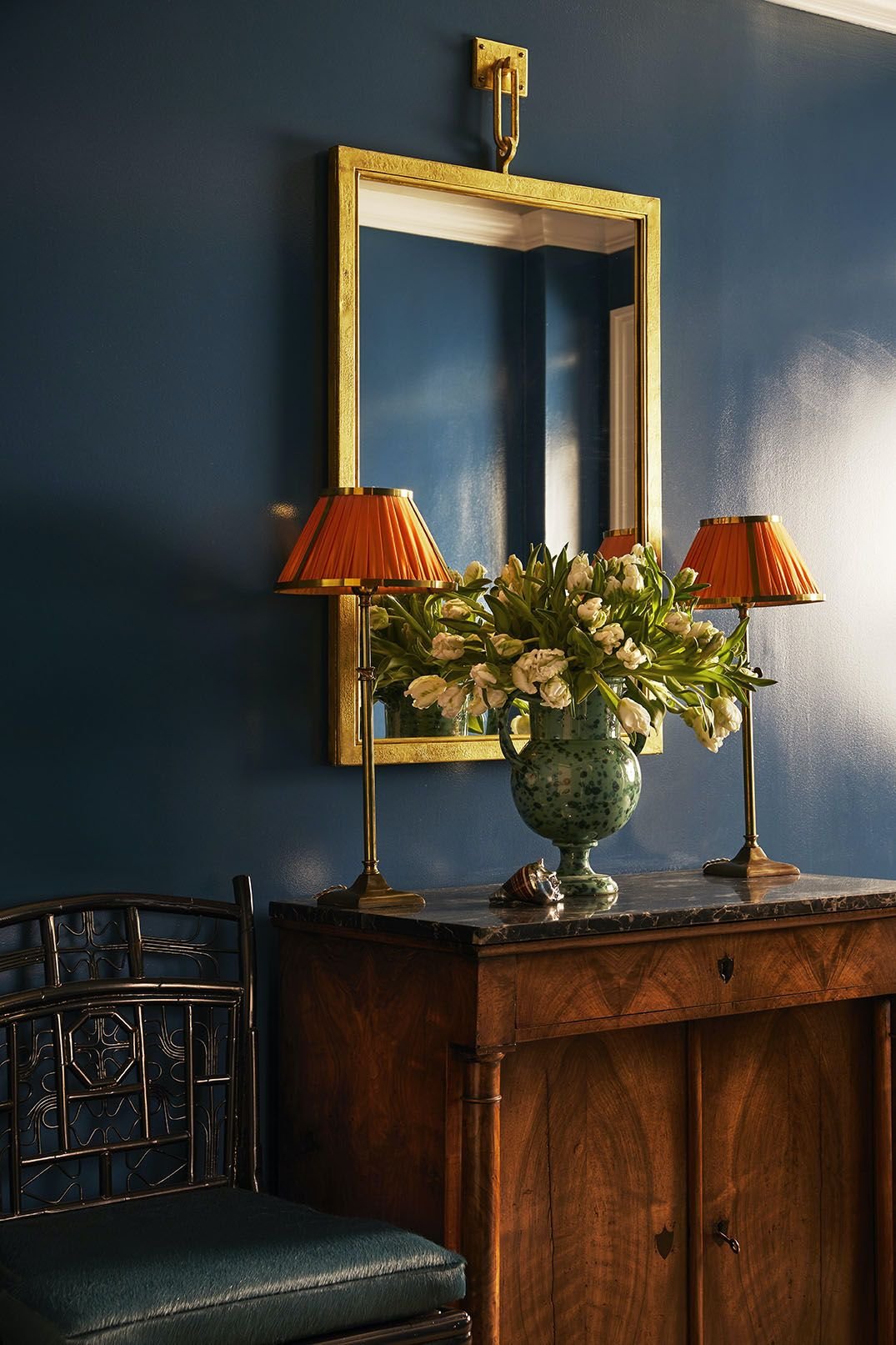
We sourced a new vanity that had more storage than the original, filled the space better, and had two sinks as opposed to the one sink our clients were previously using. The new vanity matched better with the historic charm our clients were hoping for. The antique brown Mahogany finish perfectly complements the warm green of the bathroom walls. More charm was added to this space by including antique brass as the hardware throughout the bathroom. It was the perfect pairing to the mahogany vanity, green walls, and tile selections throughout. 

Bedroom Refresh

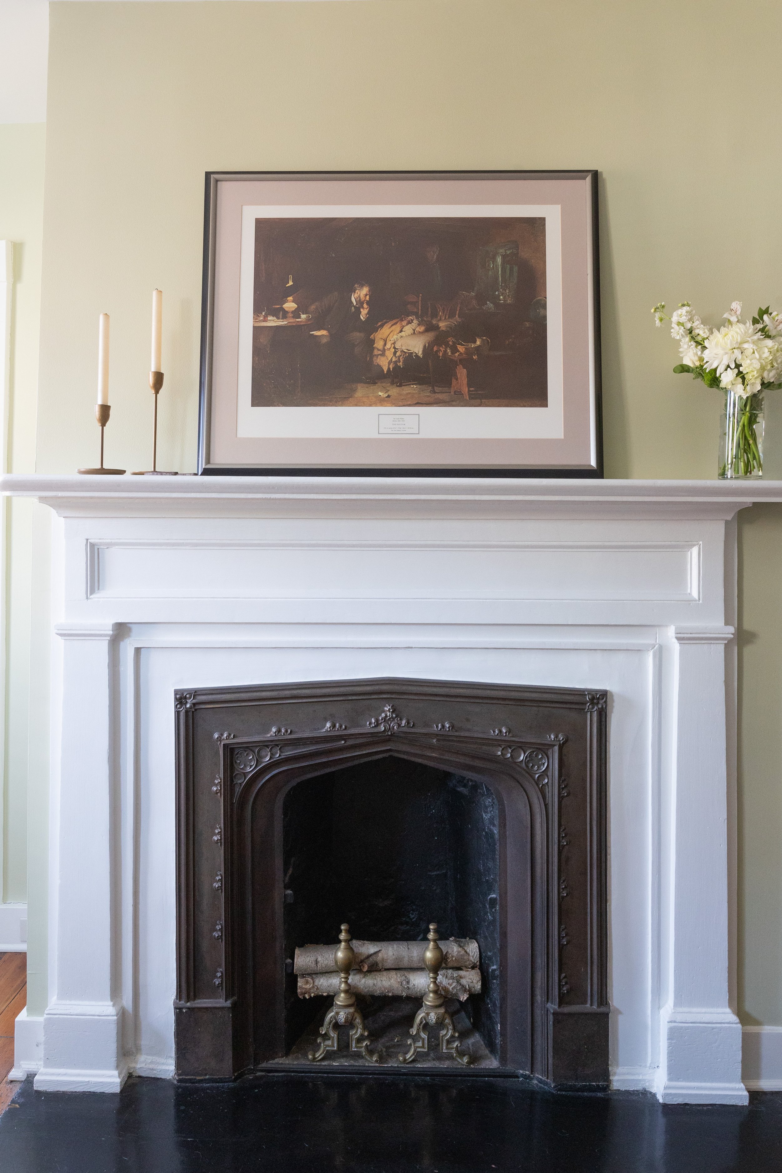
While the bathroom was getting a total overhaul, the bedroom was also getting a makeover. The power paint can have on a room is remarkable. This job is in the heart of Annapolis, MD, the historic district. Without seeing the street this home is on, you would have never known this home was historic. Our clients were missing the historic charm and character their home once had. Choosing colors from Benjamin Moore’s Historic Collection was a no brainer for our clients. The exact colors from the collection were not as easy of a choice. 

The final color choice for the walls was Guilford Green. This shade perfectly matched the space our clients were hoping to create. Benjamin Moore describes the color as a gentle green hue with pleasing warm undertones. Our clients wanted their bedroom to flow well with their bathroom and this color was the perfect choice. To create a monochromatic space, the doors of the room were painted with a medium olive tone paint warmed with muted yellow undertones. This shade is Georgian Green also from the Historic Collection from Benjamin Moore. 

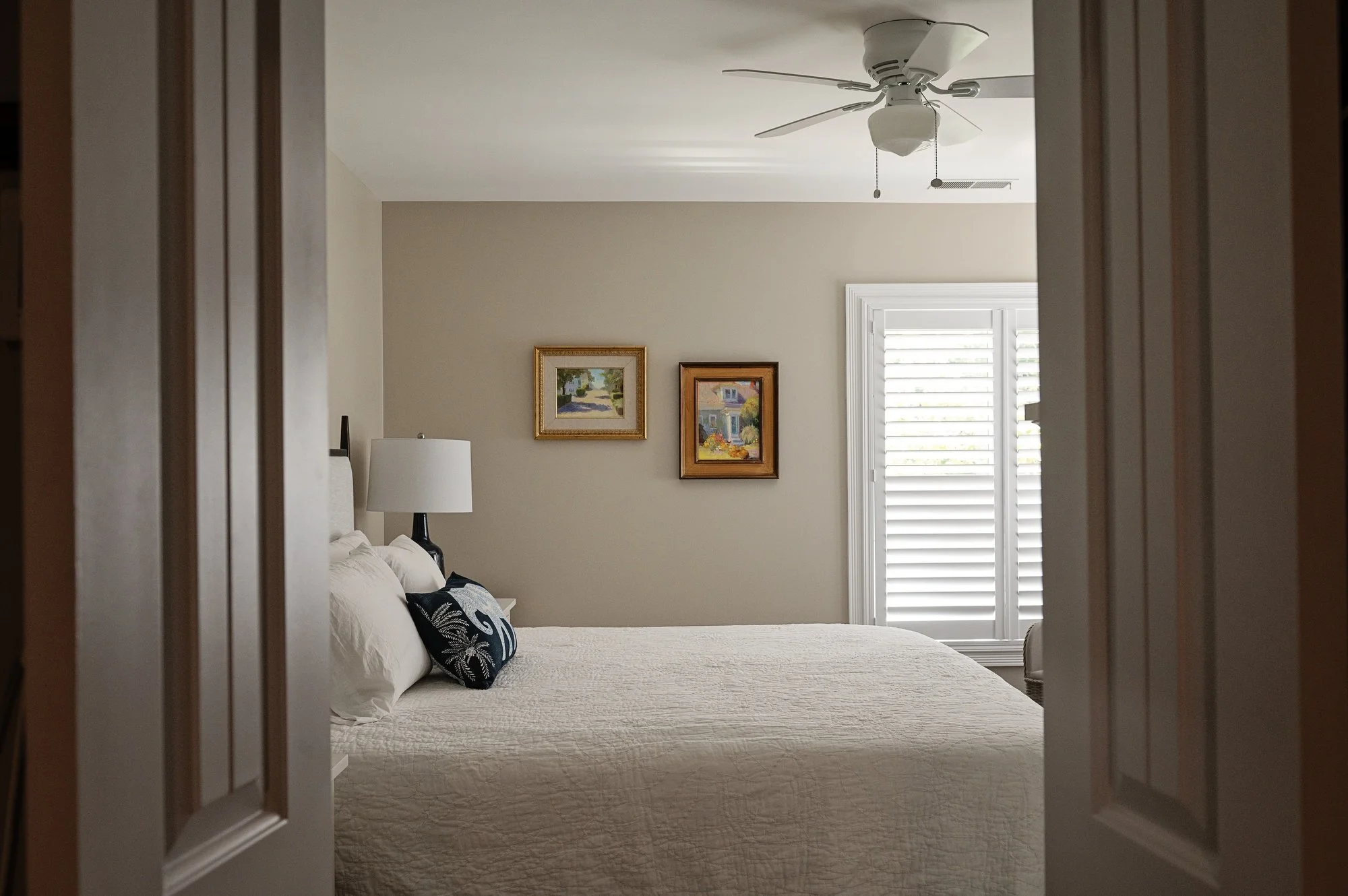
The primary suite  is now a calm space to unwind at the end of the night. The freshly painted walls gave the room a rejuvenated feel, making it appear larger and more open. Adding back the character and charm of their historic charm was the most important part of the project for our clients. The historic colors were the final touch on this primary suite makeover.
Your entryway is the preview of your home

An entryway refresh may be exactly what your home needs. It seems like a separate room entirely, but it truly connects the different rooms in your home. Your entryway may be a dual purpose space. It can also be used as the mudroom, a drop zone, and an area for storage. 

Setting up your entryway to fit the needs of your family is important. There are many projects that can benefit your entryway. Why not add some storage or a bench to make getting out of the door in the morning that much easier. Updating this space to help create better flow in your home is a no-brainer. Whether it is functional flow, aesthetic flow, or both, an entryway refresh may be the next project on your list. 

Quick and Easy Repainting

Adding a fresh coat of paint to your entryway can bring all your rooms together smoothly. You may have colors that don’t flow together or maybe it is the same color throughout your entire home. Your entryway is the first impression people have of your home. Keeping the color scheme flow throughout can create a welcoming space. Utilizing coordinating colors throughout each room can emphasize the barrier between each space without feeling too separate from one another.

Create Solutions for Storage Problems

The entryway is often a drop zone when entering the house. Shoes, keys, bags, and anything else you may be holding get left right by the door. Adding in a solution for this storage problem can keep the shoes away and the keys from getting lost. Adding builtins to your entryway adds the storage you need and is customized to your needs. Do you want show and coat storage? A bench to put your shoes on in the morning? Custom builtins may be the right addition and solution to your foyer. 

Functional Decor and additions

A ledge can be a decorative addition to your entryway while also being functional. It can add more room for decor or a place to store things needed as you run out of the house. Installing a custom ledge and coat hooks along the entryway wall can add interest to the space as well as a place to store things. Millwork can be the perfect pairing to a new ledge and coat hooks. These features are a great trio for your entryway. 

Creating an entryway that works for your family is important. Having a place for all of the things you need when running out of the door will make your mornings run smoother. When your spaces flow smoothly from one to another, it creates a cohesive set of rooms that work with one another.

4 Moulding options to add extra character

A wall can often be quite boring. Throw some white paint on the ceilings and trim and a color on the walls. There are many extra details you can add to your walls to bring in some extra character and interest to your room. Different moulding options are a simple way to bring that character back into your home. Not only do different types of moulding add that character back into your space, it also can help create cleaner lines throughout the room.

Base

Adding base trim helps make the wall look complete and can pull the room together. The best part about adding base trim to your walls is it cleans up the line where the wall ends and floors start. The edge of flooring can often be a messy line. Using base trim can hide the messy edge to create the smooth transition to the wall. Base trim also comes in many different profiles and sizes. Each profile and height can add a different look to your space. Some base trim can add traditional character and others can add to the modern feel your home may already have. 

Chair Rail

The next trim up the wall in height is chair rail. Chair rail often sits around 32 inches up from the floor. This height can be adjusted depending on the height of the ceilings. 32 inches is a standard chair rail height for 8 foot ceilings. Adding chair rail is a way to create a line to have two-toned walls. There are many types of chair rail that can add different details based on their style. Adding chair rail to your room adds the opportunity to add a ledge to add a decorative touch or be the perfect opportunity to add a bold color to your room without committing to the color on your whole wall.

Picture Rail

Adding picture rail can do more than just being a place to hang pictures from. Adding picture rail to hang photos is a way to add character especially when you choose to hang pictures from it. Other benefits of adding picture rail to your home is the opportunity to create a vintage feel and creating the option to make a two-toned room. Painting the ceiling one color and bringing that color down to the picture rail is a great way to add the illusion of higher ceilings. 

Crown

Similar to base trim, crown moulding can help smooth the line between the wall and the ceiling to create a clean transition. Crown is another way to add character to your home. There is a vast array of styles of crown moulding making it able to fit any style home. You can add traditional style crown moulding or opt for a modern style for an updated look to your space. Adding crown moulding to your home design can elevate your space and add to the style of your home design. 

Any type of moulding or trim can add character to your space and make it feel more complete. These types of additional details can help hide irregularities in your wall, floor or ceilings and create clean lines. These styles of trim and moulding come in an array of options suited for any home.

Partial Overlay vs Full Overlay vs Inset

From cabinet color, flooring material, countertops, and backsplash, there are so many decisions to make during a kitchen remodel. The type of cabinet panel you choose is another decision to be made. There are three types of panels that you can choose from, partial overlay, full overlay or inset. Keep reading to see what the difference between each panel is and what makes them different from one another. 

Photo: Jamie Horton Photography

Photo: Jamie Horton Photography

A partial overlay panel is the cheapest panel type. Partial overlay panels sit on the front of the cabinet with gaps between the doors. The gap is often one inch between each door and is the most traditional looking panel. Going with a partial overlay provides the best option for a tight budget project. Another benefit of partial overlay panels is that it provides a little bit more storage than inset panels because the door is outside of the cabinet. 

Photo: Jamie Horton Photography

Photo: Jamie Horton Photography

Full overlay panels are a similar concept to partial overlay panels, but the doors sit flush to each other rather than a one inch gap between the doors. A full overlay looks more similar to inset panels since there is no gap between the doors. This provides a more high end look compared to the partial overlay.

Since the doors sitting flush next to each other, the making of these cabinets is slightly more precise than partial overlay giving them a slightly higher price tag. This panel type gives the look of inset panels with the additional storage space of partial overlay panels.

Photo: Jamie Horton Photography

Photo: Erica Hufnell Photography

The highest-end panel option is inset. With this panel option being the highest-end available, it is also the most expensive option. Creating inset cabinet door and drawer panels is a more precise process than creating partial and full overlay panels because the panel sits within the face of the cabinet. 

This style cabinet creates cleaner lines with it being flush in the cabinet face and all hinges are hidden inside the cabinet. Inset panels create a more custom overall appearance to a space rather than either type of overlay panel. One downside of inset panels is the potential presence of gaps between the panel and cabinet frame. This gap is hidden when overlay panels are used because of the overlap on top of the cabinet frame.

No matter what panel option you choose for your project, the end result will look incredible! These options are not limited just to kitchens. All three panel options can be utilized in bathroom projects or when adding custom built-ins to any room in your home.

Starting a tile project, but unsure how to finish it?

Updating tile in your home is always an exciting and fun project. Finding the perfect tile, color, and pattern can really bring a room from good to great. Finishing off the tile edge is another one of those fun decisions that you may not realize comes with multiple options and looks. Keep reading to see what options are available to finish off the edges of your next tile project.

Schluter Metal Edging

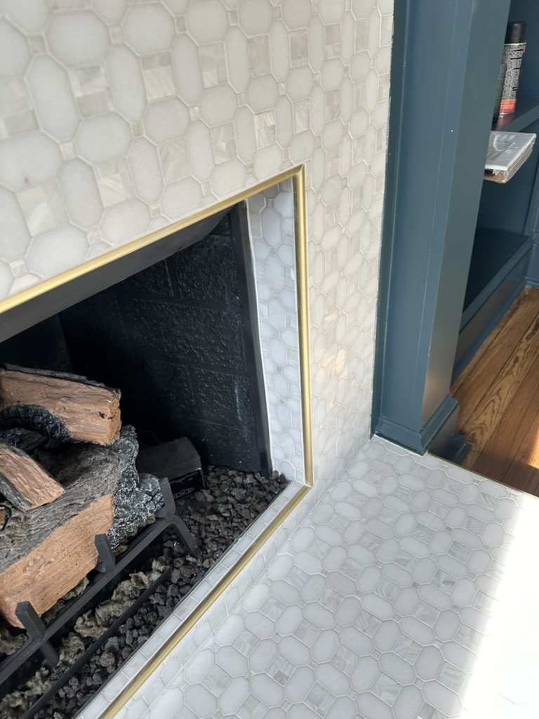
A common choice for different tile locations is Schluter metal edging. This choice comes in many colors and reveals offering many options to pair with your tile selections. Using metal edging is one way to protect your tile work. Tile can chip on edges and corners through everyday wear and tear, but metal edging protects the tile from potential damage. Style and colors can be chosen based on tile and grout color to ensure every aspect of the space looks great. Schluter can be featured in bathrooms, showers, and even fireplace surrounds!

Bullnose Tile Pieces

Bullnose is another option to finish off tile. This option can create a crisp transition from tile to wall without introducing new colors or materials. The shape of the tile is slightly different than the rest of the tiles used. It has a curved or finished edge on one side allowing it to act as the end of the tile design. This clean edge provides a seamless end to your next tile project. This in progress project uses the bullnose piece to finish of the shower wall design and as the trim along the flooring to create a seamless design throughout the bathroom.

Mitered Corners

A mitered corner can be a great option to choose when it is possible. Not all tiles can be mitered. When a tile selection can be mitered, it can provide the cleanest edge possible when completing a tile project. A mitered corner requires each tile to have a 45 degree angle cut on the underside of each tile to allow them to meet up to the other tiles and create the 90 degree angle needed for a clean straight edge. A mitered corner creates the cleanest option to finish off a tile project due to its precise edge and clean angles.

Pencil Trim

Utilizing pencil in a tile design is another option to provide a finishing touch. Pencil offers a thin but raised edge to the surface. This is a rounded edge which can be an added benefit by avoiding options with sharp corners (like mitered corners) especially in areas with high traffic of children. This smooth edge design is inspired by none other than an actual pencil. On top of being used on the end or edge of a tile design it can be used within the design of a backsplash. It could be used as a border around a detail piece above a stove that features a different tile or pattern. Pencil is a great choice to use between two different types of tile that would meet on a corner or even flat on the wall.

Chair Rail

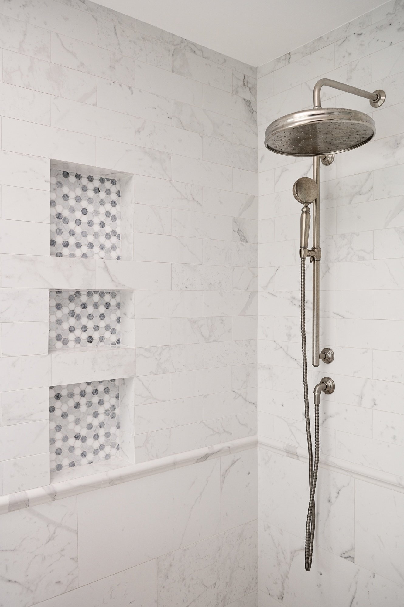
If you are interested in adding an extra detail in the design, chair rail may be the perfect choice. Chair rail often has ornate detailing that can elevate any project. It is often used to finish off a mosaic tile design, but its capabilities are endless. This tile edge option has many abilities and is a simple way to add some character or charm into a fresh tile project. Adding chair rail as a tile edge option can give your project extra flair that other tile edge options may not be able to provide. This detail focused option can even be used on a wall to separate one sized tile from another, just like it is featured in this shower.

Tile edges are the last step of choosing a tile for a project. It is important to find the right edge option for your tile to get the look you want and protect the tile to allow it to last as long as possible. You may have trouble finding the tile you want and an edge option that matches, but don’t fear Blue Star can certainly help find the perfect choice to finish off your project.

Why should I worry about curb appeal?


Curb appeal can have loads of positive effects on the home. It can make you smile…and maybe even your neighbors. Curb appeal is sometimes landscaping and other times improving the home itself. Improved curb appeal can benefit your home while you are living in it or when you are preparing to sell. 

Your home’s exterior is like making a first impression, you only see it for the first time once. Curb appeal helps that first impression. Your home’s exterior can be a sneak preview to the personality of your home. Do you like warm neutrals and clean color schemes? Do you prefer bold bright colors and patterned wallpaper?

Keeping up with curb appeal can enhance your neighborhood. Updating your home’s exterior could make your house the best on the street or the prettiest one in the neighborhood. A little paint can go a long way in making your neighborhood look a little bit better. 

People often make home decisions based on what they will be able to sell it for in the future. Curb appeal is important when looking to increase property value. People of course look at the interior of your home when looking to buy, but the exterior is also important. Curb appeal could be the deciding factor of what your home could sell for or if someone would want to buy it. 

Blue Star can assist with improving that curb appeal. If you need to refresh the trim painting, we’ll bring our ladders and get to work. Interested in updating the siding color, we can help with picking a color and providing samples. A new front door and updated windows may seem like it wouldn’t change much, but it truly makes a difference.


4 tips for finding paint color inspiration

Picking a paint color is not an easy task. Before choosing a particular color or even color family, figuring out a plan is an important step. You may know exactly what you are looking for, and that’s great but you may have no idea where to start. Here are some tips on finding inspiration for your next paint project. 

Pinterest

Pinterest is a great platform to find all kinds of inspiration. There are new things to pin everyday. Searching for ‘living room paint color ideas’ is a great way to see different style options or specific colors for your space. Each search can be specified to a different room of your house. Pinterest is a great platform as it provides visuals and descriptions to be able to see the concept in real time and help you visualize it in your space.

Drive through your neighborhood

When looking to update your home’s exterior, the answer may be right in front of you. Going for a drive or walk through your neighborhood with a focus on other exteriors may open your eyes to see ideas that may be right in front of you. Looking for inspiration in your own neighborhood can give you a realistic idea about how something may look since you are in an area with similar elements and architecture. 

Watch home improvement TV shows 

With the abundance of home improvement shows on TV, there is inspiration all around. Seeing a home renovation play out on your screen can allow you to see why different paint colors are used in different rooms with different styles. Seeing the final product of the home can help see what a freshly painted home would look like with different styles that may be similar to your own style.

Follow Blue Star on Instagram and Facebook

Looking at previous work your painter has done is another way to find inspiration for your project. Seeing previous work Blue Star has done may provide you the exact inspiration you need. There is even an added bonus of looking at our work on social media…we know all of the paint colors we have used.  

Finding inspiration may seem hard, but determining what you like and dislike can make that process a little bit easier. Finding inspiration online and in person will be able to make your color selection easier during your paint project.

7 neutral paint colors you can't go wrong with

Choosing a paint color can be a daunting task. With so many options, shades, undertones, and sheens, choosing a color may not always be a quick process. Having the basic idea picked out narrows the choice down, but not by much. If you have decided on a neutral color scheme and can’t decide what neutral shade to pick, keep reading to see 7 neutral shades you can’t go wrong with choosing.

White Dove | OC-17

Our go-to suggestion for white paint when a client asks is most often Benjamin Moore’s OC-17. This color is always the perfect shade to bring some neutral tones into a colorful space or be the blank canvas for starting a fresh neutral color palette. This color looks great on siding, brick exteriors or fireplaces, refinished cabinets, or simply on your walls.

Accessible Beige | SW 7036

Accessible beige is the perfect neutral balance with its gray undertones. This is one of those colors that sometimes looks beige and in other lighting can seem heavier on the gray look. Accessible beige may be the perfect addition to your next bathroom project or living room refresh.

Alabaster | SW 7008 

Bright white paint can almost have an overpowering cool effect on your space. Alabaster has the warm qualities missing in many other bright white paints that bring the warmth from the sun into your home. If you have been considering painting your brick white, take this paint color as a start the project (with Blue Star of course).

Navajo White | SW 6126

The yellow undertones of Sherwin Williams’s Navajo White make it one of the warmer options when choosing a white shade. This shade can act as the perfect shade to neutralize a space that you may feel is currently too colorful. 

Cloud White | OC-130

OC-130 simply has the perfect balance of warm and cool-toned white. It creates the blank canvas you need to show off your style in your artwork and decor. Cloud white by Benjamin Moore brings the blank canvas to your walls to fill with pieces allowing them to truly stand-out.

Anew Gray | SW 7030

This warm-toned gray from Sherwin Williams is a great neutral option for your space. Some gray’s can have too cool of undertones making them hard to choose for a home with classic and traditional elements. The undertones of Anew Gray can bring the warm undertones into a space that has warm elements already while still utilizing a neutral color.

Dusty Trail | PPG1097-4

One of PPG/Glidden’s most popular colors is Dusty Trail. The best part of a neutral home is its calming presence when you walk in. This calming neutral shade is the perfect addition to the laundry room, basement, or any other room you want to bring a little calmness back into the space.

Any paint color you choose can be the perfect addition to your home. If you need any help picking out the perfect color, let us know. We’ll be ready to help when you need it.

Optional Bathroom Add-Ons

A bathroom renovation can be a cookie cutter style job or you can jazz it up with different details to make your bathroom completely customized. Many optional add-ons can be included in your bathroom renovation project to create the perfect space for you to start and end your day. 

Heated floors may not sound like something you need, until you step on those cold tiles in the winter. Adding heating underneath your floors can make your morning routine more manageable in the winter and help you wake up on those cold mornings. 

Toe kick lighting is another addition to your space that helps ease the wake up process or even those middle of the night bathroom trips. Overhead lighting can be too much on your eyes late at night or early in the morning, toe kick lighting can prevent that strain on your eyes. It provides minimal lighting where you can see just enough without hurting your eyes.

Adding in a custom bench, shelf, or niche can be that perfect element to complete your shower. Adding these details can even be multipurpose. The bench can be a seat when you don’t feel like standing or act as a foot rest for shaving your legs. The addition of a shelf or niche can add style in your storage. The adhesive or suction shelving that you can add after your renovation is complete can often take up space in your shower or even fall off the walls, having a shelf or niche built right in can keep your products hidden and safely resting in your shower.

You can never have enough storage space. Add vertical storage can get the space you need without taking up too much of the floor plan. Utilizing the space above countertops can add extra storage and even be easier to reach. Little details in the countertops can be added to add countertop space and be the perfect ledge or lip to place most used products like a toothbrush or your skin care. 

These additions are not necessary for a bathroom project, but they really take your space from good to great. Having a space customized to the way you use it is always the best option. Adding details to your bathroom that make it YOURS will make it that much more enjoyable to use your space. 

Are you ready for a refresh?

A kitchen refresh is one of those projects that can have a show stopping change on your home without changing the layout of the space. Pairing a few small projects together can elevate your kitchen and keep your home refreshed. 

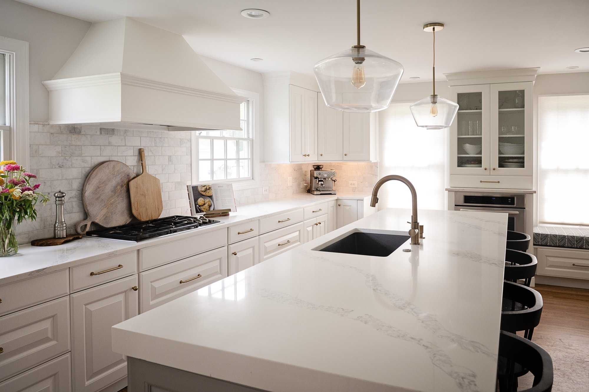
Cabinet refinishing is a great place to start a refresh project. Taking cabinets that are currently a dark cherry or super orange maple, and painting them a neutral color or even a bright shade can elevate your space. Cabinet refinishing projects are a great choice because they can entirely change the look of your space without affecting the layout or losing the integrity and quality of your current cabinets.

Another small job that can elevate your kitchen is changing the hardware and fixtures. Selecting new knobs or handles can bring life back to your cabinets. Whether you love the current finish but want to update the style or want to switch from brushed nickel to matte black, updating hardware is a small detail that really refreshes the kitchen. If you decide to update those drawer pulls, don’t leave out your fixtures. Updating the faucet can seem like an unnecessary task in your refresh but it will make all the difference at the end of the project. 

Picking out a new backsplash or adding a backsplash to an area that once wasn’t there is a stylish and logistic choice. A backsplash's main purpose is to protect your walls from any messes that come along with cooking. So on top of being a fun addition of style to your space, it actually will better the space you prepare food in and make it easier to clean.

Doing just one of these projects will give your kitchen the face lift it deserves. When you pair all three projects together you may forget who’s kitchen you are actually walking into. A kitchen refresh can be as simple or complex as you’d like it to be. Are you ready to refresh your kitchen?

How to Use Sherwin Williams 'Match a Photo' Tool

We know how great Pinterest is for finding inspiration for a home project, but how many times have you seen the ‘perfect’ color and can’t figure out what it's called or who sells it? Sherwin Williams has your back. 

With their home color tools you can use your inspiration photos to find colors that pair well with your vision or even find similar colors to what you have found online. Keep reading to see how you can use the Sherwin Williams Match a Photo tool to color match your Pinterest finds with paint colors Sherwin Williams sells. 

Your first step is to visit Sherwin Williams Website.

Once you reach the home page, use the toolbar across the top of the page to locate “Services & Resources” and click the drop down arrow.

The drop down menu will appear and you will want to click “Home Color Tools”

Scroll down until you see the title, “Try Color in a Virtual Space.” This page offers three great tools to use to be able to visualize a color in your home. The focus of this post is the “Match a Photo” tool. Click “Match a Photo”

Next, you will see another page, click “Match a Photo” again. This is the step where you will need your inspiration photo from Pinterest.

This step will vary depending on the device you are using. On a computer, you will select a photo to match that is saved in your downloads or photos. On a smartphone, you can use a picture right from your camera roll. Once you pick the photo you want to match, upload it and accept Terms of Use. 

Clicking anywhere on the photo will populate Sherwin Williams paint colors. You can click and drag to find different colors too! There is also a color palette feature to save the colors you like together. 

Do you have any Pinterest inspiration photos you would like to try out with this tool? Give us a call once you narrow down your color choices.

Interior Paint Project Prep

Getting ready for a home improvement project can sometimes seem daunting. These projects can often create a mess, putting your home in disarray. Preparation is the most important part of a project. Prepping properly is the best way to make sure the paint is applied correctly and lasts as long as possible.  We focus on our prep work to make sure the project is completed properly. There are ways you can prep your space for an interior paint project too. You may be asking where you should put your belongings or how you can help. Here are 5 things you can do to help prep for your interior paint project:

1. Where do I put my valuables and breakables?

The best first step for you to do when getting a room painted is to remove all important items from the work area. This could be loads of things in particular rooms. From knick-knacks, heirlooms, or even your children’s irreplaceable art masterpieces. Removing all valuable or breakable items from a room being painted is the best way to keep them safe throughout the painting process. 

2. Do I take things off of my walls?

Removing all artwork or wall hangings before the paint crew arrives is a great way to keep your items in pristine condition and be able to hang them back up after the work is completed. Having all items removed from the walls allows our painters to prepare the space the best way possible.

3. What do I do with all of the nails in my walls?

There are two options when it comes to the nails in the walls, leaving them in the walls to rehang items or take them out for all holes to be patched. The easiest way to decide what to do with each nail is to determine if you want to rehang your wall hangings in the same place or move things around once the painting is done. If your plan is to update your space with a fresh coat of paint and hang all items back in the same place, leave the nails in the wall. If you are in need of a total reset and are planning to start from scratch with new paint and new décor, take the nails out of the walls. 

4. Do I move my furniture?

Once all wall hangings are down, move all items and furniture into the center of the room being painted. This gives the crew space to move around the room while they work on the walls. We will then cover all items in the room to protect from any paint that could possibly get where it is not supposed to be. If you need help moving some furniture pieces, let your project manager know.

5. What’s next?

Sit back and relax. No need to worry about straight lines or climbing a ladder. Let Blue Star do it. We will bring the ladders, the brushes and the paint. All you need to do is pick the color and we will do the rest. 

All Small Spaces Don’t Need to Look Small

Some rooms are small and others may just look small. Certain paint colors can accentuate how small a room is or looks and other colors can create a space that appears larger than it really is. There are some ways to paint a room that can make it appear larger. You may be thinking that interior painting consists of whatever color you want on the walls with white trim and white ceilings. Switching it up from that classic combination is a way to change the appearance of the size of a room.

One way to make a room appear larger is to paint your walls, ceiling, and trim all the same color. Whether you are picking a shade of blue or a light beige color, this paint technique can create a larger looking area in a small space. When using the same color from the walls all the way on to the ceiling, it is harder to see where the walls end and the ceiling starts. This illusion allows for the ceiling to look higher than it actually is. If your home has lower ceilings, this is a strategy you may want to consider when painting your home’s interior. 

Using high contrast colors in a space can create a wider appearance to a seemingly narrow room. Pairing a very light color with a deep dark color can enhance the width of a room to make it look and feel wider than it really is. You can never go wrong with a classic pairing of black and white but considering other colors with high contrast is a unique way to achieve the look of a wider space when you have a narrow room. 

Utilizing shades that complement the natural light that a space has is another way to make a room appear larger than it really is. Warm tones can provide an environment to create as much light as possible. On the other hand cooler tones do not create as much light which would not complement natural light in a way that would make a space look larger than it really is. 

Painting a room a deep dark color at first doesn’t seem like a way to make a small space look larger, but dark colors can actually make a room appear larger. Similar to the concept of painting the walls, trim, and ceiling the same color to make a room appear larger, dark colors can provide the illusion of a wall being farther away than it really is. Unlike the previous concept of painting the entire room the same color, when using a dark color it is best paired with bright white trim to bring a crisp brightness to the room. 

Adding an accent wall in the far end of a room and painting the ceiling that same color can elongate a space. Having the ceiling and the wall at the far end of the room a deep burgundy while keeping the rest of the walls in the space a soft beige, can make the ceiling look longer and the accent wall feel further away.

There are many ways to make a room appear larger, paint is one of the ways to do so.

Front Door Color Inspiration

An exterior paint job is the perfect project for the spring. Keeping up with exterior paint around every 10 years protects your home from the elements and it’s fun to be able to have a home that looks brand new without moving. To go with a new exterior color a complementary front door color is also an important decision to make. You may not be looking to change the color of your siding but you want to switch it up in a small way, changing the color of your front door is a great way to change the look of the exterior but on a smaller scale. 

Light and Bright

Having a lighter shade or muted exterior color can be paired well with a bright front door color. Having muted green siding and pairing it with a bright yellow front door can complement each other well. Light blue siding with a bright blue or teal front door is another way to have a light or muted siding and a bright front door.

Monochrome Moment

A front door can often be painted to be the focal point for a home’s exterior by using a front door color with strong contrast to the siding. Another color idea would be to go for a monochrome look by painting your door the same color as your siding or picking the same color but one shade lighter or darker can bring a simple but chic look to your home’s exterior.

Pop of Color

You may be interested in painting your home’s exterior in a class white are going bold and painting your home black. Your house may already be black or white. But adding a pop of color with the front door is a great way to change the look of your home. Whether you prefer classic colors like red or green or want to switch it up with a teal, these homes have similar concepts but look completely different with the front door color choice. 

Wood and Neutral 

Sometimes, multiple colors is not what you want. Having a home exterior that is a color and pairing an unpainted dark wood door can create a traditional look. A dark stained door is an option that would go with many of the 2024 home trends. Keeping things natural is trending in many parts of the home for 2024, why not bring that style inside and out by having a natural stained wood front door

Primary Pairing 

You may not have put much thought into the colors you learned about in elementary school but sticking to the basics of primary colors is another way to pick a front door color. If you are painting your home’s exterior blue, consider the idea of a yellow front door. These are two of the primary colors and have good contrast. The contrast between these colors creates a classic look while utilizing a simple idea like pairing primary colors together.

2024 Colors of the Year

What is 2024 going to be when you think of paint? Warm neutrals? Deep bold shades? You may not know what colors to paint your home. The 2024 colors of the year may help you narrow down your color search. If not, it may help you decide what colors you don’t want… 

Every brand has different colors and shades for their color of the year but something that seemed popular among many of the brands was the color blue. Over here at Blue Star, we were thrilled to see the popularity of the color blue, it is in our name afterall. Keep reading to see what colors will be trending in 2024.

Benjamin Moore: Blue Nova

Ben Moore chose the perfect mix of violet and blue for their 2024 color of the year. Blue Nova blends these colors to create a bold statement in any room the paint is used. Consider adding this blue to a room in your home in 2024. It may just be the perfect color to pull your space together. Whether you use this as an accent in the room by painting a bookshelf or making a bolder choice and painting the full room. Blue Nova is a great choice for your 2024 paint project.

HGTV Home by Sherwin Williams: Persimmon

Persimmon is a warm earthy terracotta. With its tangerine undertones, it complements many of the other home trends for 2024. Pairing this nature inspired shade with earth natural earthy trends like live edge wood shelf or raffia light fixtures will help bring the outdoors in which is expected to be very popular in 2024. This bright shade is going to leave a statement in the home no matter what other details are paired with it. 

PPG: Limitless

The warm yellow PPG chose for their color of the year is the perfect balance between adding color to your home while still keeping it neutral. This shade is sure to last in your home for years no matter how many times you redecorate. You may have all white cabinets and all white walls and have been debating adding some color into your space. Limitless is a great color to start adding more color to your space. 

Sherwin Williams: Upward

2024 may be your year of meditation and relaxation. Sherwin Williams chose the perfect color to add your home to create a calm space. Upward is a cool toned breezy blue. With its underlying tones of silver this shade is a perfect color to add to a primary bathroom to create the feeling of a spa getaway in your own home. 

Valspar: Renew Blue

Similar to Sherwin Williams Upward, Renew Blue by Valspar also has a calming effect on the space it is in. This shade of blue has notes of green that adds to the calm energy the paint color can bring to the space it’s used. Whether you use this in a communal living space or your children’s bedroom, a sense of peace will be present with this blue-green paint color on your walls.

Behr: Cracked Pepper

This moody soft black is the perfect color to add depth and a statement to your home. If you want to make a bold change in 2024 this is the perfect paint color for you. Behr chose this soft black as their color of the year which will pair perfectly with gold hardware or and decor around your home. Whether you want to make a bold statement in a dining space, powder room, or a home office, Cracked Pepper is a perfect color to make a bold change in 2024

Minwax: Bayblue

Paint and stain can sometimes go hand in hand. Minwax chose an out of the box color of the year for their stains. Bayblue may not be a color you would have ever thought to add to your home, but now you may be reconsidering. Another color of the year that has a goal of combining the indoors with the outdoors, this blue green-shade is inspired by the oceans and the bays. Minwax drew a connection between water and wellness when choosing this color for their color of the year in hopes that adding a nature inspired color to the home will bring wellness to people in 2024.  

Blue Star Paint & Property: Hague Blue (Farrow & Ball)

This year, we wanted to join in on the fun and select our very own color of the year. With all of the trends expected in 2024, the word classic continues to come to mind. Classic and timeless go hand in hand. Many trends expected for 2024 are trending because of the desire to create a timeless space with classic elements. We chose a paint color for 2024 that we think is classically Blue Star. This color can be used to create a moody bathroom, add a pop of color on your trim, or even as an exterior paint color. Blue Star’s 2024 color of the year is Hague Blue by Farrow and Ball. This deep blue can be added to any room to create a timeless look in your home.

2024 Lighting Trends

Whether you are the kind of person who likes overhead lighting on at all times or you prefer a dimmer option by using only a few lamps, the right light fixture can make or break a room. Light fixtures can sometimes be one of the parts of a home renovation or small home refresh that gets forgotten about. No worries, you won’t forget about the lighting after you see the expected lighting trends of 2024.

Polished finishes, natural materials, and retro styles are a few of the trends that we are expected to see in lighting in the new year. The most popular finish and color of light fixtures is always changing. Whether it’s silver or brass, matte or shiny, every year's trends seem to be different. This coming year polished fixtures have been expected to be the more popular choice over matte fixtures. If you prefer silver over gold or black over brass, shiny fixtures are the way to go with lighting in 2024, no matter the color. 

Natural materials and soft lines is another way to go with lighting in 2024. Bringing the outdoors in has been gaining more and more popularity over the years as the push for sustainability expands. People are starting to prefer organic and handcrafted shapes instead of factory finishes and sharp edges. Looking for fixtures that highlight natural materials like rattan or raffia, different types of wood, or even twine. Adding these materials to your home through a light fixture will create a softer space instead of dark metals that are often the materials used in light fixtures. 

If adding bold and unique elements to your space is up your alley, this trend will be perfect for your dining area or any other place you think a chandelier should be. Bold chandeliers are still gaining popularity and are expected to rise in popularity next year. 2024 is expected to see even more abstract shapes of chandeliers. The style of these trending chandeliers may be different than what’s hanging in your house or maybe your parents house. Traditional style chandeliers are not what is currently trending. Cool shapes and fun styles are trending for chandeliers. With shapes inspired by art and sculptures, a unique chandelier is the right choice for your next light fixture. 

Trends move in circles. What was once popular years and years ago often becomes popular again. Have you noticed brass is becoming all the rage again? Retro style light fixtures are set to gain popularity. These retro pieces have become more popular from the increased interest in creating timeless spaces with design. One specific retro style that is increasingly popular is the use of milk glass. You may only think of milk glass when it comes to vases for your floral arrangements but finding light fixtures that utilize milk glass will also create a timeless look in your space. The 1950s has many style elements that are making an appearance in different parts of the home, milk glass in lighting is just one of them. 

Whether you are looking to add some subtle throwbacks into your home or create a space that embraces the outdoors, lighting is a fun way to bring your project together in the end. You may not know what light fixture you want to add to your home, and that’s okay. We can help you make sure your project makes your house feel like home, one light fixture at a time. 

2024 Woodworking Trends

Woodworking may not be top of mind when you think of home trends changing. But trends and styles are always changing and are changing everywhere. 2024 is going to see some different trends that Blue Star can help you add to your home. 

You may have been debating adding custom shelving into one of your rooms but have not figured out what exactly you want or where you want it. 2024 is going to be the year of dark wood tones. Adding custom floating shelves or other wood installs is the perfect way to add this 2024 style to your home. Utilizing a naturally darker wood or staining a lighter wood with a dark stain is another way to add this trend to your space. These wood installations featuring dark wood tones can keep your home up to date with 2024 styles.

Built-ins are a great way to add storage and style to your home. Whether you want to add them to a living room, wine cellar, or even a primary bedroom, built-ins are the way to go in 2024. Updating a room in your home to stay on trend is always a fun project but when you add style and functionality it makes it even better. Built-ins can create a cohesive look in your home and reduce visible clutter. Creating custom built-ins can keep your home in-style, functional, and customize your space to fit the needs of your family.  

Natural wood and sustainable materials have been gaining lots of popularity over the last few years. Using a wood piece that has a live edge can create a much softer look than straight edges and sharp corners. A live edge can bring the beauty of the outdoors in with its natural look. 

Thinking sustainably in woodworking is one more way we can help the environment. Finding pieces to add to your home in a sustainable way can add character to your home while helping the planet. Salvaging wood from somewhere else or using reclaimed wood can add some charm into your home that a brand new piece of wood may not be able to. 

Harsh lines are on their way out but organic edges on softer shapes are going to be all the rage. Adding soft edges and abstract shapes into the wood elements in your home can create a unique and customized style instead of a ‘cookie-cutter’ look that sharp edges can create. 

Millwork is another way you can add a unique and customized look to your space. Adding vertical shiplap as an accent wall in your primary bedroom or board and batten in a powder room can create a handcrafted look in your space. Beadboard could be added to the back of your island cabinets is a hidden detail in your kitchen. 2024 is going to be all about creating personalized timeless spaces and millwork is one of the ways to add a custom style to your home. 

Adding built-ins, live edge shelves, soft lines and millwork can turn a house into a home. Adding any of these elements will allow your personality to shine through in your space while keeping up with the trends of the new year. The trends expected in 2024 have a timeless look allowing your space to tell the story of you for years to come.

2024 Tile Trends

Tile is one of those materials that can be used almost anywhere in your home. In 2024, new and exciting trends are expected. Most years trends are out with the old and in with the new. With tile being a material that can make your home look dated quickly. 2024 is expected to see trends that offer a more timeless look and have traditional elements and keep your home looking “current” longer. 

Something that possibly seems like an overwhelming idea for flooring is checkerboard tile. Don’t let the idea of a 1950’s diner scare you. This classic pattern can be done in many different ways. It can be subtle be using two colors with a low contrast or going for the classic look white high contrast colors like black and white. This pattern is not exclusively for floors either. It makes a great option for an updated backsplash.

A checkerboard pattern may not be your style, and that's okay! Patterns in general are expected to be seen in all tile in 2024. Whether it is tiled patterns or patterned tile. Intricate geometric patterns with a handcrafted look are gaining popularity. This trend does not need to be an explosion of color to make a statement. Laying neutral tiles in a basket weave or herringbone pattern are a perfect way to use tile in 2024. Using a detailed pattern when laying tile is great in any room but is going to be especially popular in smaller areas like entryways or mud rooms. A patterned tile on the other hand can bring a simple space to life. You may want to add some pattern to bring color into a simple white kitchen or jazz up a wall in a bathroom. Patterned tile can create a bold look in any space. 

Terrazzo is another tile that can be bold and create a unique look in your space. Utilizing this type of tile as a kitchen backsplash or any other place in your home. Whether you hold earth tones close to your heart or you're interested in branching out to add some vibrancy with bright colors to your space. Terrazzo has been a popular tile choice for years and it isn’t going anywhere anytime soon. Maybe this is your sign to add terrazzo to the floor of your bathroom or a focal point in your kitchen.

Nothing beats a classic look. Another classic style is mosaic tile. This timeless look is supposed to rise even more in popularity in 2024. Mosaic tile is a very versatile option. It can add charm to your house whether you pick a custom pattern or use precut sheets. Having the option to use a precut sheet or create the pattern on your own is one of the reasons mosaic tile is a great and versatile option for your space. 

For several years, monochromatic and neutral designs were all the rage in every part of the home. 2024 is expected to see the return of colors, especially in tile. Rich colors with lots of texture are going to be trending in tile. Adding color to your space does not need to make your bathroom design seem complex. You can use bold rich colors and still have a simple style bathroom.

With the return of traditional elements in the limelight. Terracotta tiles are going to be seen more often in 2024. This tile has an endless variety with the option to come in all sorts of shapes, sizes, shades, and textures. Terracotta gives an effortless and timeless look to any room it is added to. 

2024 is going to see lots of new trends but tile isn’t going anywhere. This coming year is seeming to be the year where traditional elements make their way back into the home. Whether you go for the classics like checkerboard patterns or mosaic tiles on your bathroom floor or update your backsplash with terrazzo, 2024 is going to be trendy in tile. If any of these styles made you interested in a home project, let us know and we can provide an estimate to make your ideas a reality.